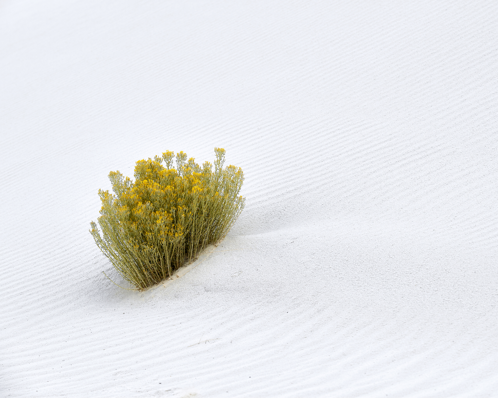
I know I am supposed to like and to produce minimalist photographs. Dominant, singular subjects against a diffuse and often homogenous background are striking. Particularly if black and white. There is no denying that the photographs of Michael Kenna, e.g., or Hiroshi Sugimoto’s still life and abstract work, some of Fan Ho’s street photography, again e.g., are striking. As are some of the portraits of Arnold Newman. Color photography too offers lovely examples, not infrequently the iconic lone tree on a hill (or versions of the radically expensive Rhein II). Long exposures of piers extending out into water, or the pylons that used to support some pier or other structure jutting out from the water in both black and white, and in color, make compelling and convenient subjects for minimalist photographs.
The lure of minimalist photographs is real. They offer a chance to pause and to think. There’s a type of quiet calmness to them. They encourage a sort of meditative reflection. The simplicity (minimalism) is a nice alternative to the frenetic and noisy world. But they risk being mechanical. They rely not on the interplay of different visual elements so much as the prominence of a single visual feature. The key is finding a way to isolate a subject. Sometimes this is easy; sometimes difficult.

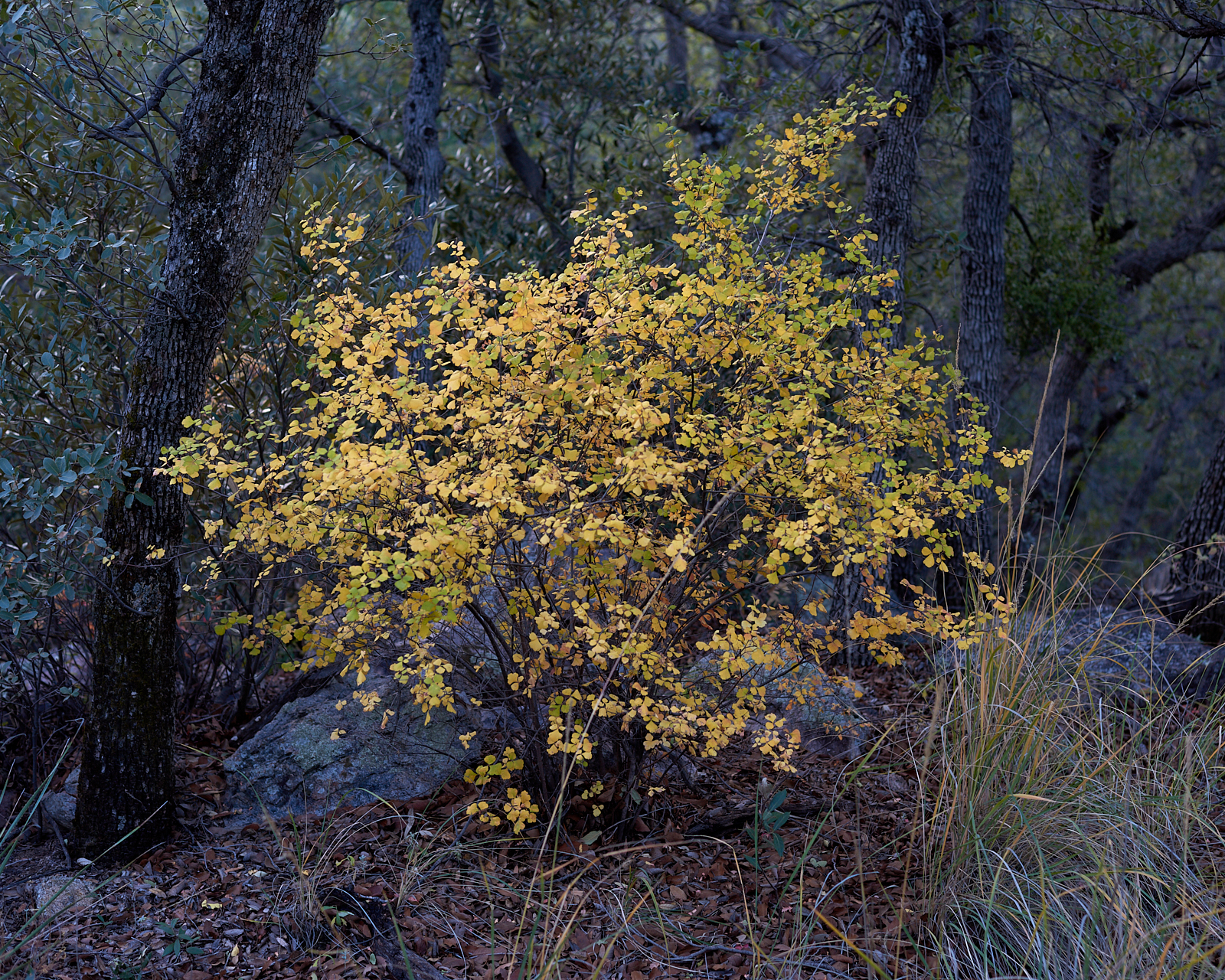
Photographs with more in them, more visual elements encourage a different way of composing and of viewing. Even when there’s a dominate subject, the busyness around that subject, thinking about what portions of the foreground to include, what part of the background to obscure with the main subject, ask me to think differently about composition. And the resulting photograph, while still offering a bit of quiet contemplation, prompts me to think more about the setting, the scene, and the context.
