Photographic rules and guidelines are everywhere: golden spiral, golden triangles, avoid placing a subject dead center, center the dominate eye, don’t divide the frame in half, strive for symmetry, avoid symmetry, create dynamic symmetry, in portraits don’t crop limbs, in headshots you need not include the top of the person’s head, steady the camera so as to avoid shake, try to create intentional camera movement, be sure to straighten the horizon, use leading lines. And, of course, everybody’s favorite: the rule of thirds.

For the most part, these seem less prescriptive rules or guidelines and more a post-hoc description of the composition of a photograph. Sure, some of these rules might be at play now and then when taking a photograph (leading lines? a very rough rule of thirds? symmetry?), but most seem to be applied by people looking at photographs. In this way, these rules seem as pointless as grades on classwork in school. They are used to justify liking or disliking a photograph and serve little purpose in helping a photographer improve (much like a teacher or professor giving a paper an “A” or a “C”).

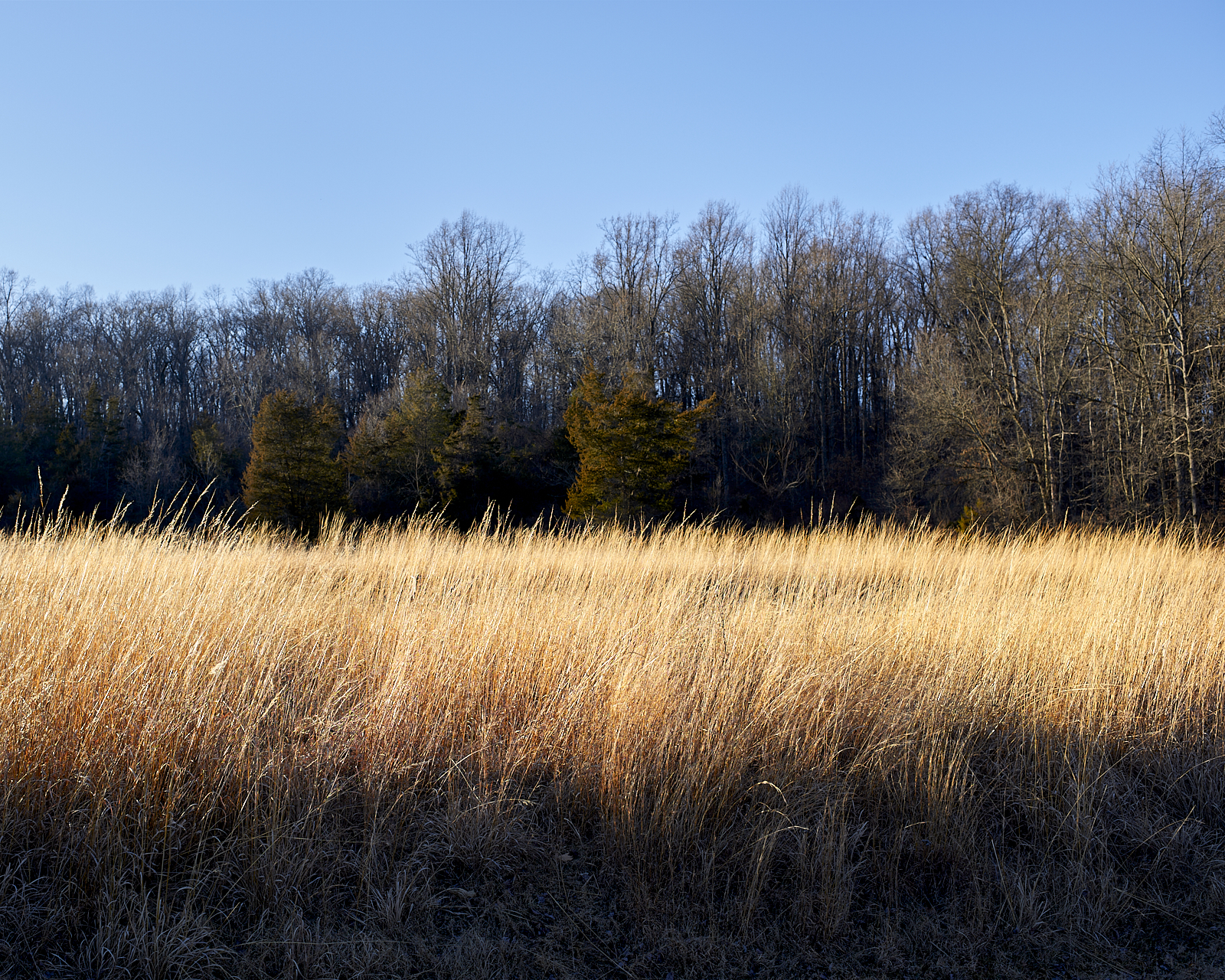
I happen to like dividing the scene into broad areas, generally three (some rule-bound person would probably equate these areas with the foreground, mid-ground, and background, but I don’t care). The relationship between these areas is often marked by contrasts in color and texture. This division of the scene into three areas is not a rule, was probably (at least initially) a subconscious aesthetic preference, but now after seeing it in a number of my photographs has become quasi-intentional (or so I tell myself).
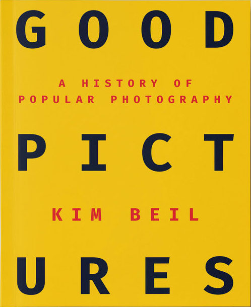
How many rules are little more than efforts to standardize and thereby authorize practices that were initially derided but have become so common that they are unavoidable? Far from establishing the practices that should be common, these “rules” try to appropriate, codify, and legitimize vernacular practices. Kim Beil’s excellent book, Good Pictures, traces some of the practices that became markers of good photography and then fell out of fashion, and some that zombie-like returned. Her interview at B&H Photo, “Speaking in Dialect – How-to Books and the History of Popular Photography,” is also worth a listen.
