In the bygone days of film photographers with the resources and energy to print their own photographs weren’t constrained by anything but the size of paper they could purchase and their ingenuity for rigging up a system to project light onto that paper. But for most people who took their film down to the local Fotomat — those goofy little drive-up kiosks in shopping center parking lots — to be developed and printed, a couple options reigned: 4×6, 5×7. You could order enlargements, but they tended to fall into one of a few common sizes. The vestiges of these formats linger in the aspect-ratio options found in most photo processing applications. Photographers today are no longer constrained by those aspect ratios, but instead can (and should) think of aspect ratio as part of composition, i.e., an artistic choice.

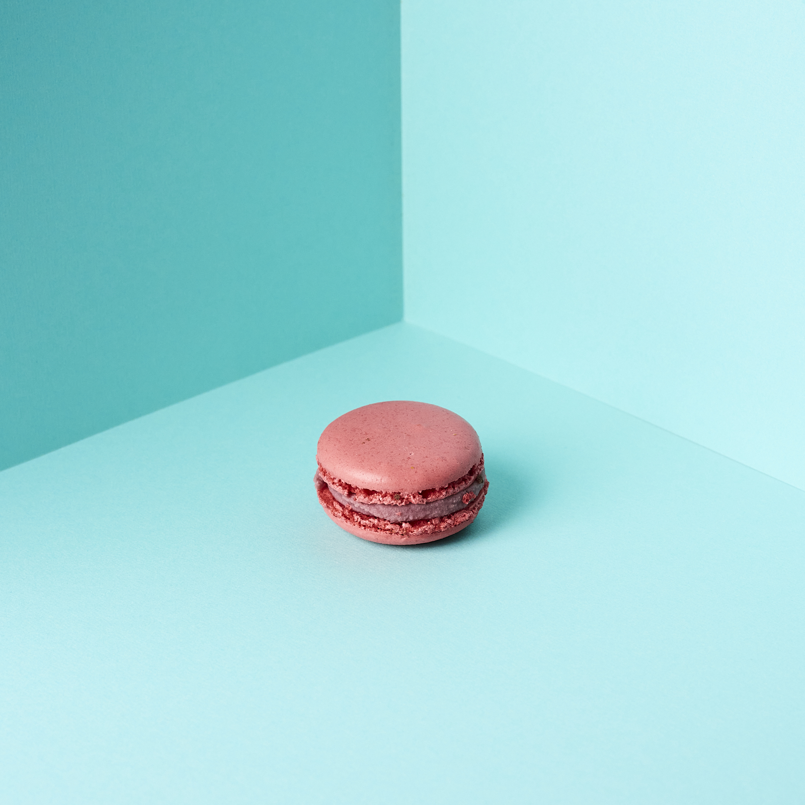
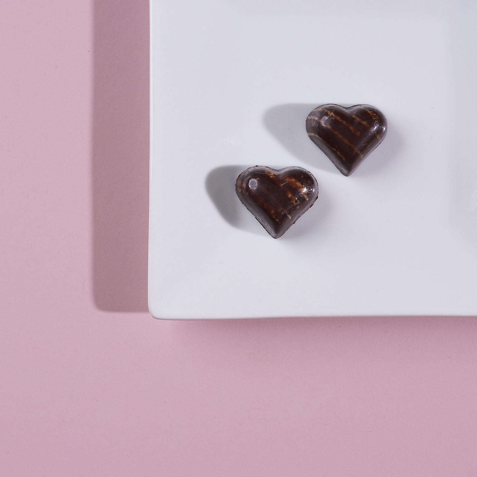
I like the square format for some photos but not all (despite Instagram’s best efforts, I think the square format doesn’t work for most photographs). For me, graphic, simple images that have a prominent subject work best. Recently I took a few photos of some macarons and chocolates from the local French café, Delice et Chocolat.

For these photos, I really liked how the square format worked well with the overall composition I had imagined. A rectangular format, e.g., 4×6, might have worked for the first image, but I think it is stronger as a square. The second image would have been a disaster in some rectangular aspect ratio.