I have begun to sort my photographs of flowers into groups. I then print a few of the images and assemble them into little pamphlets, each organized around a particular flower. A recent pamphlet focused on a few photographs of red roses.
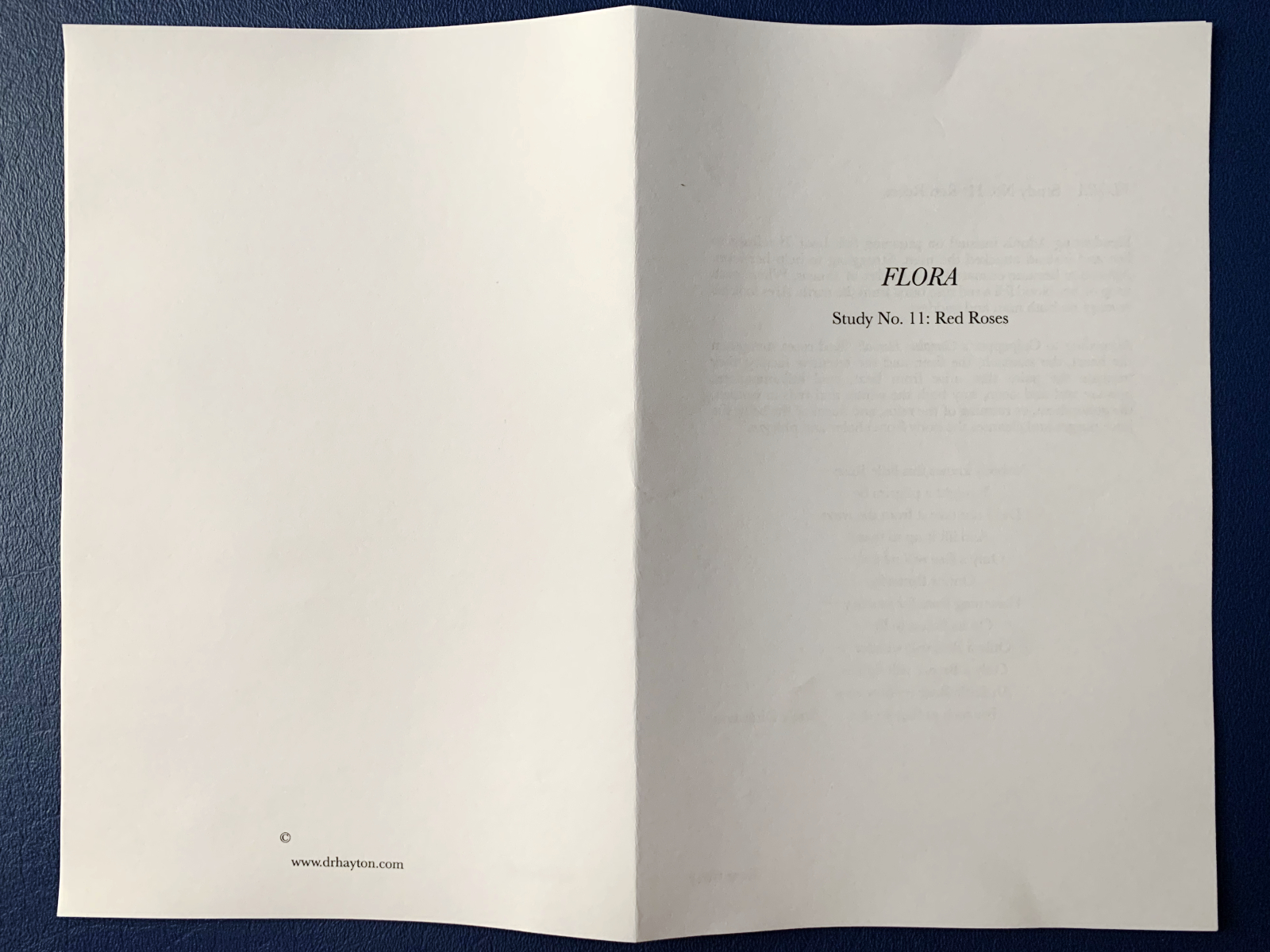
Like all of these pamphlets, this one is short. Three photographs pasted onto the pages. Very little text, limited to the first page. And like all my book/pamphlet-making efforts, this one went through a handful of drafts. Revising the text. Testing different proportions for the photographs. Printing both the text and the images on different papers.
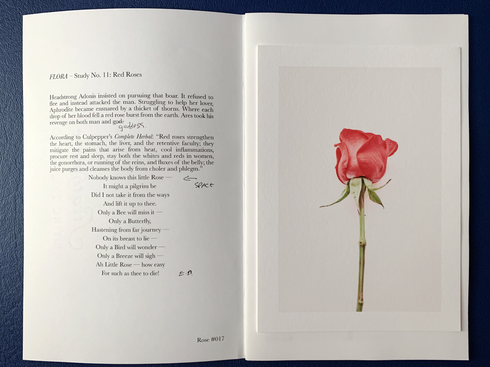
I find the process fulfilling. Something about producing something that, for me, makes photography so much richer than locking it away in some digital prison where images go to die in the social-media doomscroll.
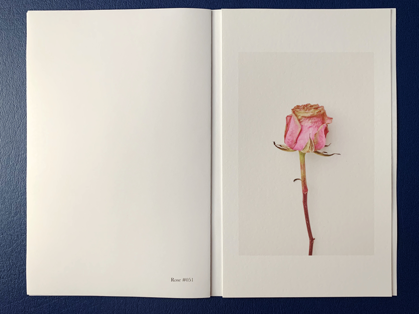
The process it iterative and full of mistakes. How many times have I pasted the wrong photograph on a particular page (as above and below)? How many times have I misassembled the pages, or misprinted them? For any normal person, I’m sure this process would be frustrating. But for me the promise of sharing my work, giving something to somebody, even if I don’t know that person, nourishes my creativity.
This particular pamphlet/study grew out of a bouquet a neighbor gave us. They were out of town when their monthly flower arrangement was delivered. They told us to take and enjoy them. I photographed the roses from the bouquet as they opened and browned and wilted. I selected three photographs for this pamphlet.
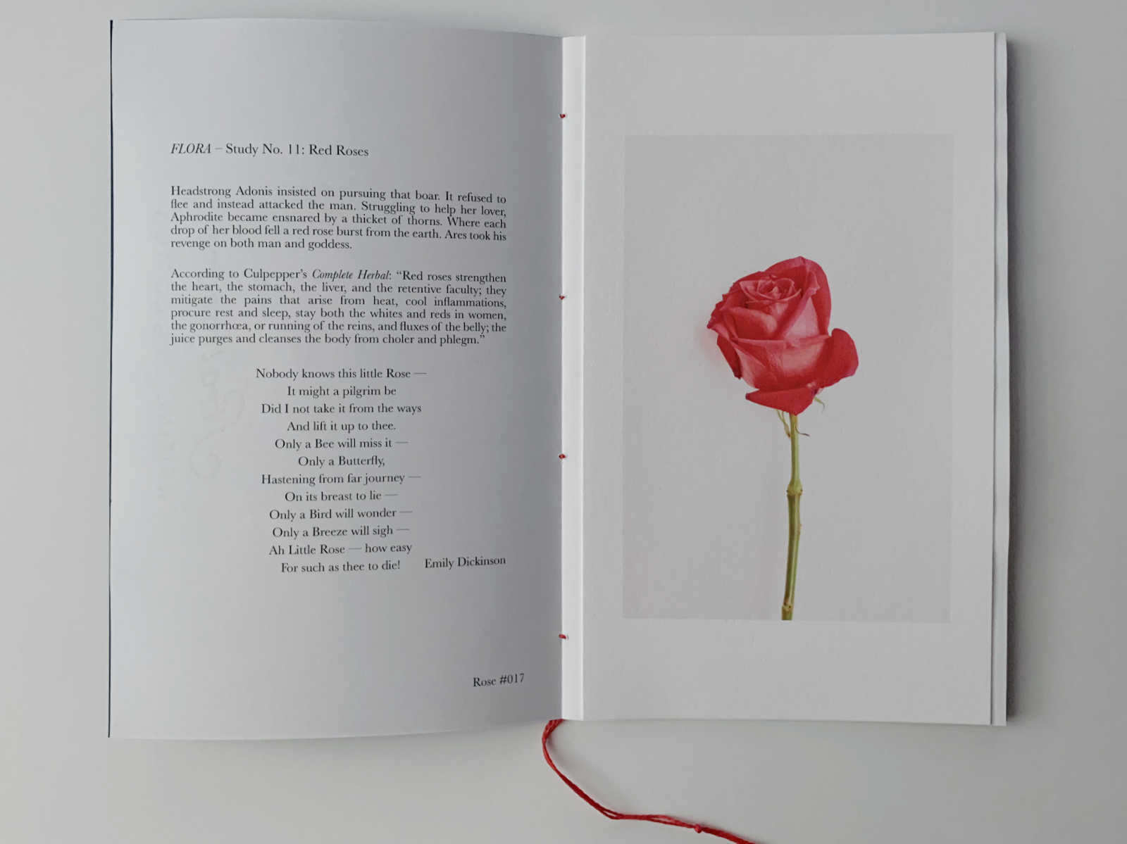
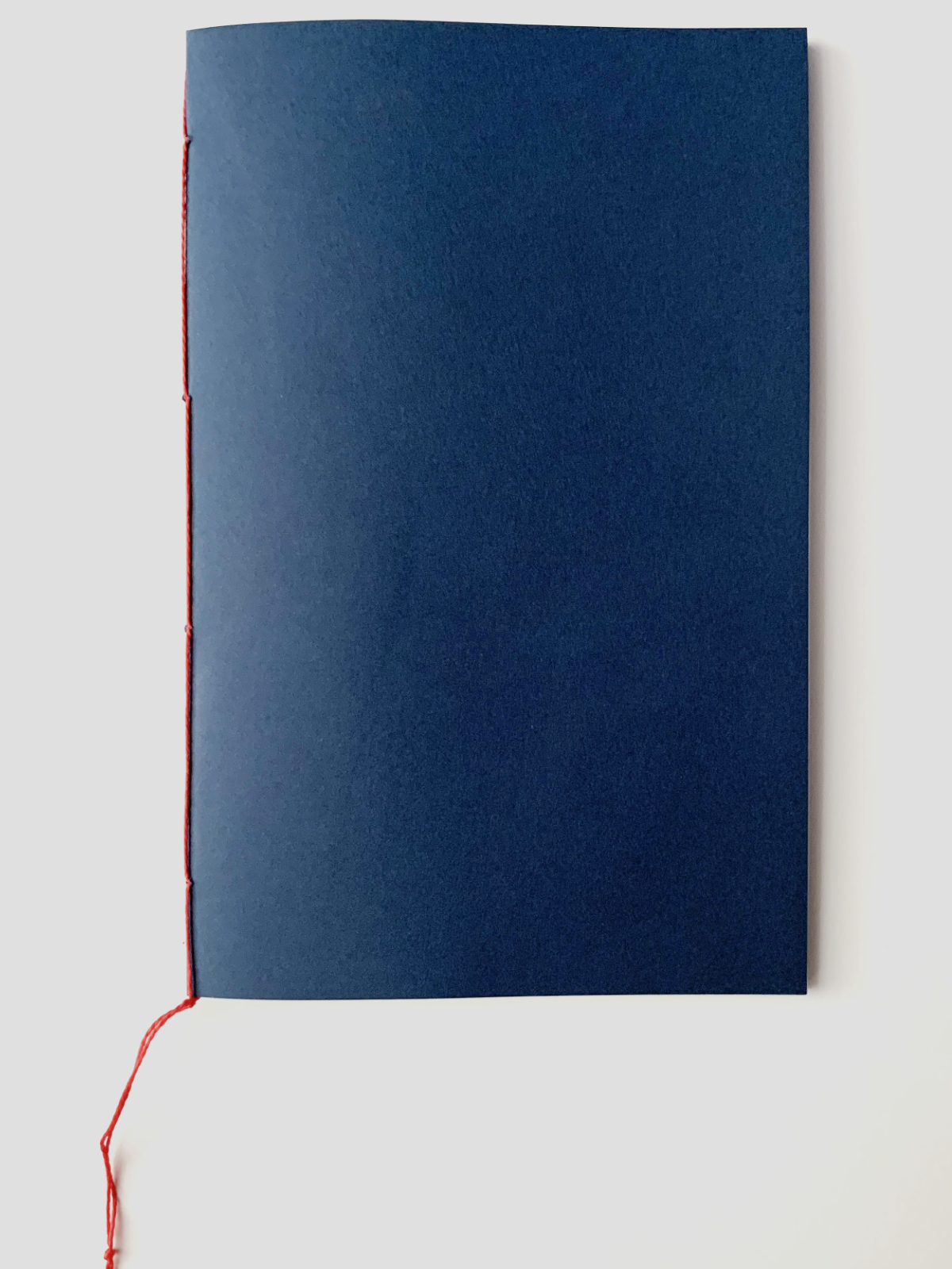
I drafted some text that linked the photographs, and printed and bound the pamphlet, with red thread because that seemed best suited for the photographs.
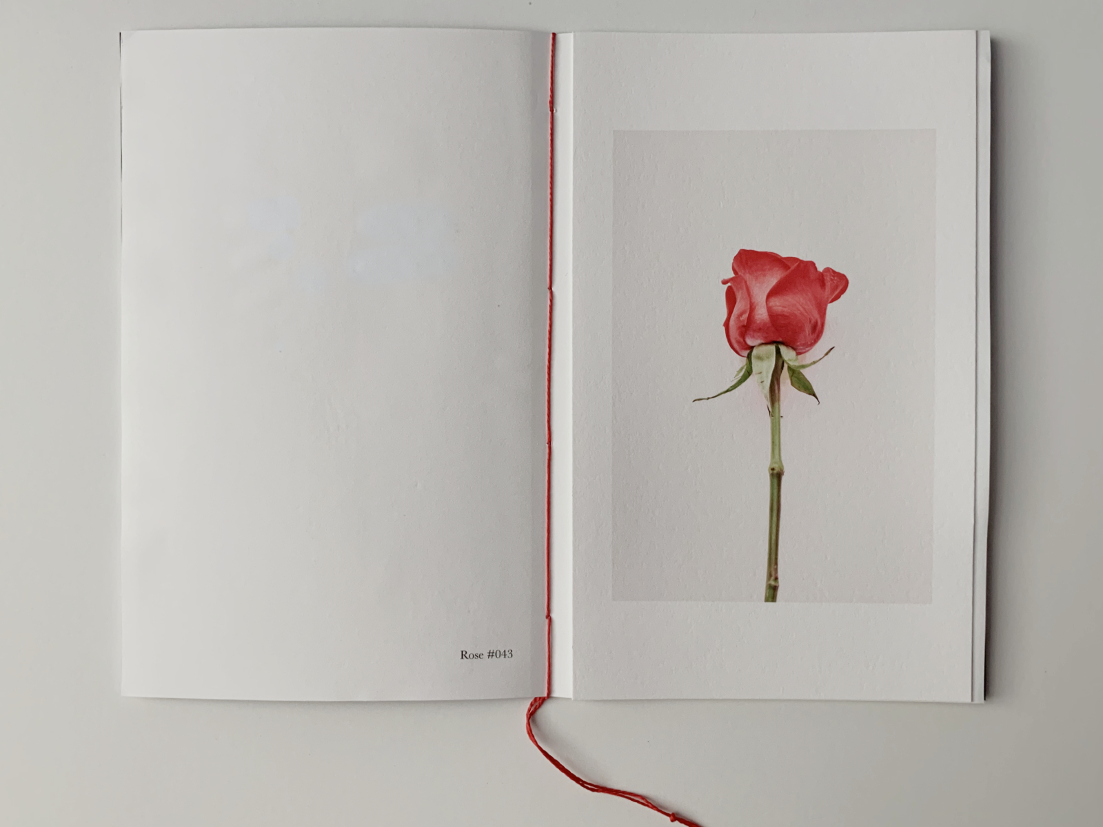
I left a copy in my neighbor’s mailbox as a thank you for the bouquet. She texted to let me know she got the pamphlet and loved it — that was kind of her to say.
I don’t know how many of these I will make, maybe a few dozen copies. These are another of the “limited editions” I create, prompted by somebody or something and limited because I think there’s a small and finite audience for them. But I’m always willing and able to print more. When I have enough of these pamphlets, I’ll print an entire set and bind them all together into a book. But that’s a project for another day.