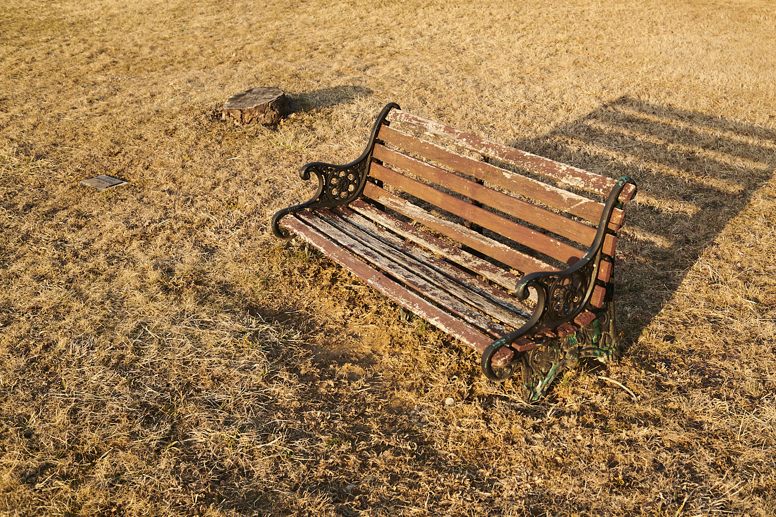
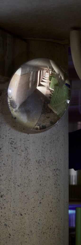
Previously a tree stood on either side of this bench. Modest trees. Occasionally somebody would sit on the bench and look out over the park. I don’t recall when, but one day I noticed that one of the trees was gone. Just a small stump remained. Sometime later, the second tree was cut down. Nobody sits on the bench these days.
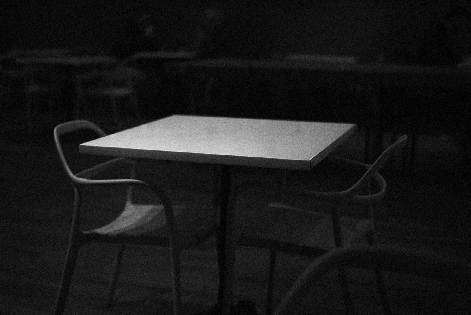
Urban #25031418.
Now flanked by two stumps, the bench slowly decays. Weather takes its toll on the wood and metal. It seems tired. Before long it will fall into ruin, another victim of neglect. Perhaps somebody will remove the broken slats and rusted metal. Then only the small, easily missed plaque will remain, stuck in the ground marking a small stump: “In memory of William B. …”
Date: 25 January 2025 Time: 4:34 pm Location: Metal Bench on Preston Field Knoll
suv rolls stop sign, doesn’t speed off but continues casually to next stop sign. seems to be in no hurry. brake lights flash, then it rolls that next sign too.
crows, three, land in a tree.
nobody in park. crows make a racket. squirrel digs in the snow.
woman with curly-haired dog enters far side of park, passes merry-go-round, continues clockwise around path past tennis court, walks between playground equipment and swings, crosses basketball court, leaves park.
nobody to be seen.
sound of bus in distance.
nondescript suburban noise.
school bus stops at stop sign. chains gangle as it slows and again as it speeds away. only a few kids still on bus.
car door slams shut.
sound of bells (fake) at haverford school. it is 4:45 pm.
jeep parks by stop sign. young woman gets out, carries bag to house on corner, enters.
nondescript suburban noise.
wm. henderson heating van turns at stop sign, drives up street.
three cars in a row slow at stop sign.
crow flies overhead.
gray car pulls into drive. person gets out, goes to passenger side, carries bags of groceries (?) into house.
woman jogs along sidewalk.
postal truck stops as stop sign, turns right.
squirrel hops through snow, stops, digs, continues hopping.
woman with large black dog crosses street, walks along path to corner of park, crosses street again, walks away from park.
two boys cut across field.
group of runners (from haverford college?) talk loudly as they run down street.
wm. henderson heating van (same one?) drives down street, turns at stop sign.
black car hardly slows at stop sign. hardly slows at next one.
blue subaru stops in front of house. man gets out. carrying nothing, he goes into house.
more crows land in a tree. caw loudly.
school bus driving other direction, stops at stop sign. but for the driver, it is empty.
Unless you had a darkroom and some motivation, film made it inconvenient to use aspect ratio as a creative option. Film came in standard sizes. If you thought a particular scene looked best in a square format, you reached for your 6×6 camera that shot square negatives. If the next scene leant itself to a panorama, you had to dig out the XPan or the 6×17 Shen Hao. Maybe you saw a scene that would look amazing on 1.31×1 ratio. Now you need a 110 Instamatic. Sure, you could shoot any scene on any ratio film and crop once you saw the enlargements, but then you would have wasted all that silver. And you had to find a place that would print enlargements that didn’t fall into one of the typical formats.
When shooting film, physical and commercial constraints discouraged (and still discourage) thinking about aspect ratio as part of the creative process.
Digital files, editing software, and photo printers lower the barrier to using different aspect ratios. Now it is easy to pick any aspect ratio that helps realize some creative vision. Sure, you might be “throwing away all those pixels,” but who cares? Pixels are cheap. Paper is relatively inexpensive and easy to trim. You can do more than crop to “isolate the subject.” Now it is easy to use different aspect ratios to achieve different goals.
Urban #250417.0.Urban #250417.1.
I love having the option to pick any aspect ratio, from square to extremely rectangular. I walk around and can think in particular ways about how to create a photograph from a portion of a scene. I use aspect ratio to create the photographs I want to see.
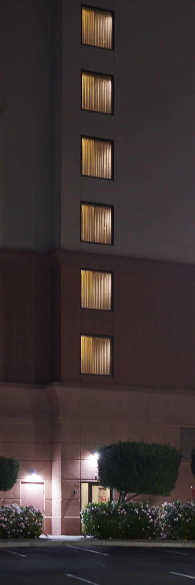
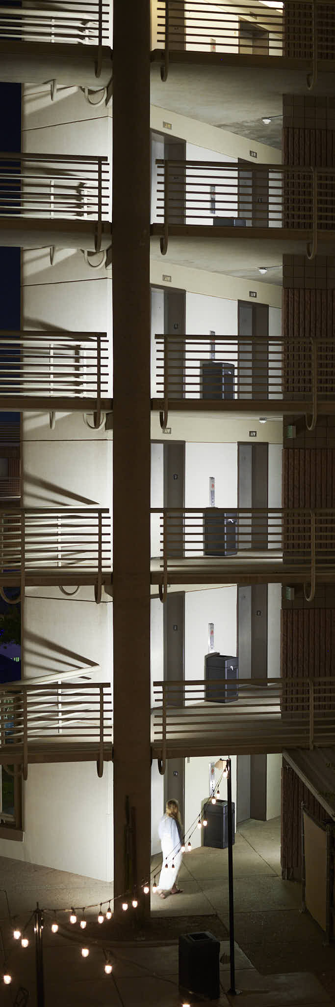
Walking along N. 44th street, for example, I saw three different scenes that seemed, to me, to lend themselves to an extremely narrow aspect ratio. A column of windows on the side of a hotel and five exterior landings at another hotel are perhaps obvious. The hallway of lights reflected in a mirror was, perhaps, a little less so.
Urban #250417.2.
In any event, the tyranny of aspect ratio is over.
I suppose in a world where the economy of likes and followers dominates, the audience will always shape what gets made. Creativity collapses into a form of obeisance, deference to the imagined or real preferences of the crowd. Although the nature of the audience has perhaps changed, the authority of the crowd has affected artistic production for centuries, since “making a living as an artist” became a possibility. Maybe that’s the problem with “art,” or at least a common notion of “art.” It requires an audience beyond the maker. Success is no longer measured by the pleasure of creating but by the approval of what has been created.
No shortage of successful artists who have dismissed “playing to the gallery” do so from the lucky position of having succeeded through the approval of that gallery. But that doesn’t mean they played to that gallery, it doesn’t mean they shaped their art to conform to some audience, it doesn’t mean they “sold out.” They might have, but in most cases we can’t know. How many artists (a word I don’t really like because it drags creativity into a commercial sphere) never “made it big” and still feel no need to play to the gallery? Sure, they probably had a “day job,” but don’t most people? Incredibly lucky are those whose day job is creating things they want to see? But the vast majority of people who have created things — visual things, musical things, culinary things, literary things, etc. — have paid the bills through some other means.
Domestic #250105.
The whole notion of being disappointed in how your creative output is received seems, to me, to miss the point of creating. If you need to pay rent, then do something that allows you to pay rent — maybe it means making something for an audience, maybe it means working for somebody, maybe it means stealing. Whatever. But don’t get angry at an audience for not appreciating your creative endeavors. Don’t be disappointed because you poured your heart and soul and energy and resources into making something that nobody liked. That disappointment, that anger, that frustration debases the act of creating, reduces it to a commodity.
Urban #241229.
I make things that are important to me. I create for me now and for some future me. An audience of two, that’s all I care about. If somebody likes what I make, fine. If somebody doesn’t like what I make, fine. If nobody notices what I make, fine. Do I think what I make is important? Absolutely. Does anybody else? I don’t care.
Maybe you have to care. Maybe you pay your bills through what you make. If so, make stuff you know will sell, get a day job. Let your creativity nourish your soul but not pay your bills. I am fortunate to have a day job that pays my bills. It allows me to make whatever it is I want to see. I make things that are meaningful to me. I don’t have care that anybody else likes what I make.
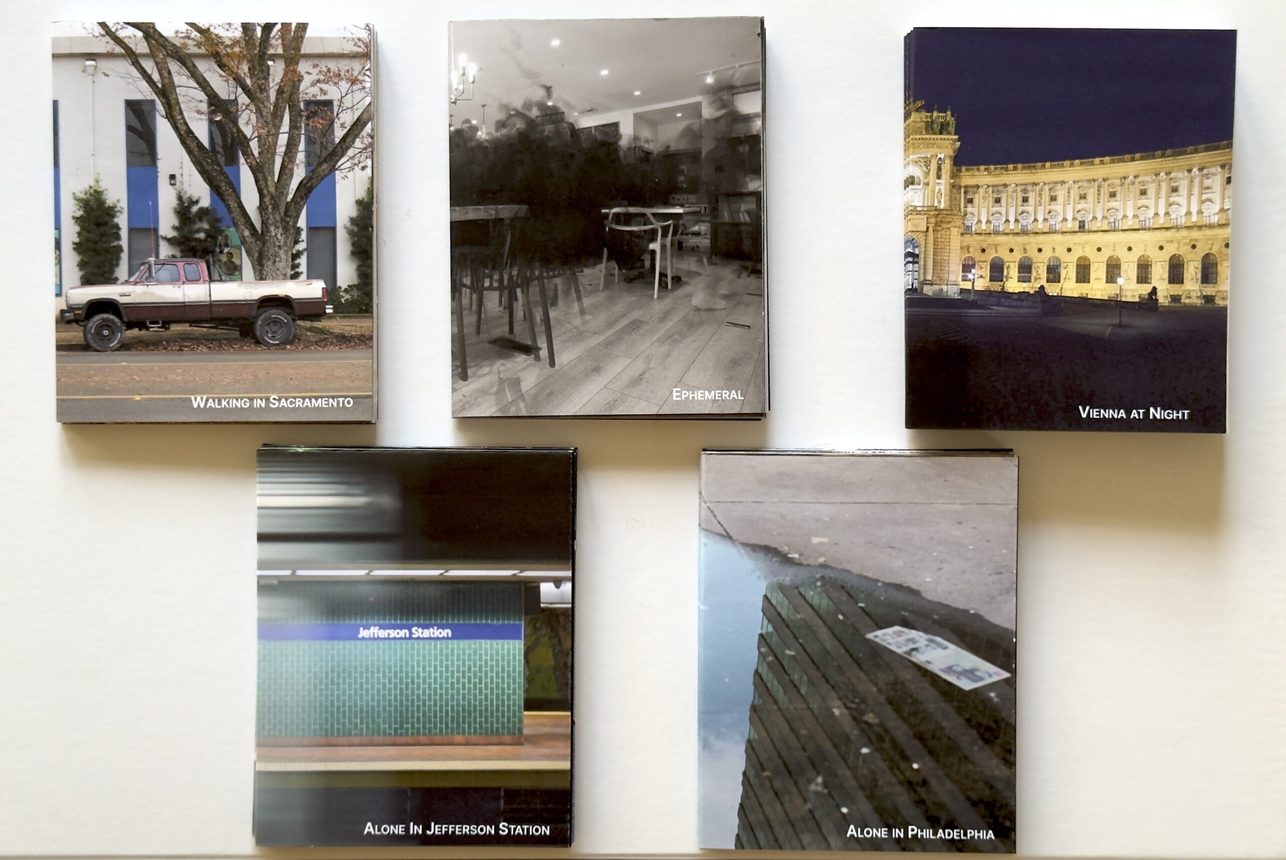
I like making things. Little things. Big things. Lately, I’ve been having fun with an 8-page zine. Printed from one piece of paper, folded, and cut, it is to me the ideal format for a short outing, or for a case study of a place. Or, I can look back through photographs I’ve taken to find a group of 8 that make a good theme.
Some of the zines I have been making lately.
They are easy and relatively quick to print and to fold. I use 11″x17″ sheets of paper, so that each page is about 4″x5″, large enough to showcase the photographs but not so large as to be bulky. I tweaked the layout a bit so that the cover image wraps around the front and back covers.
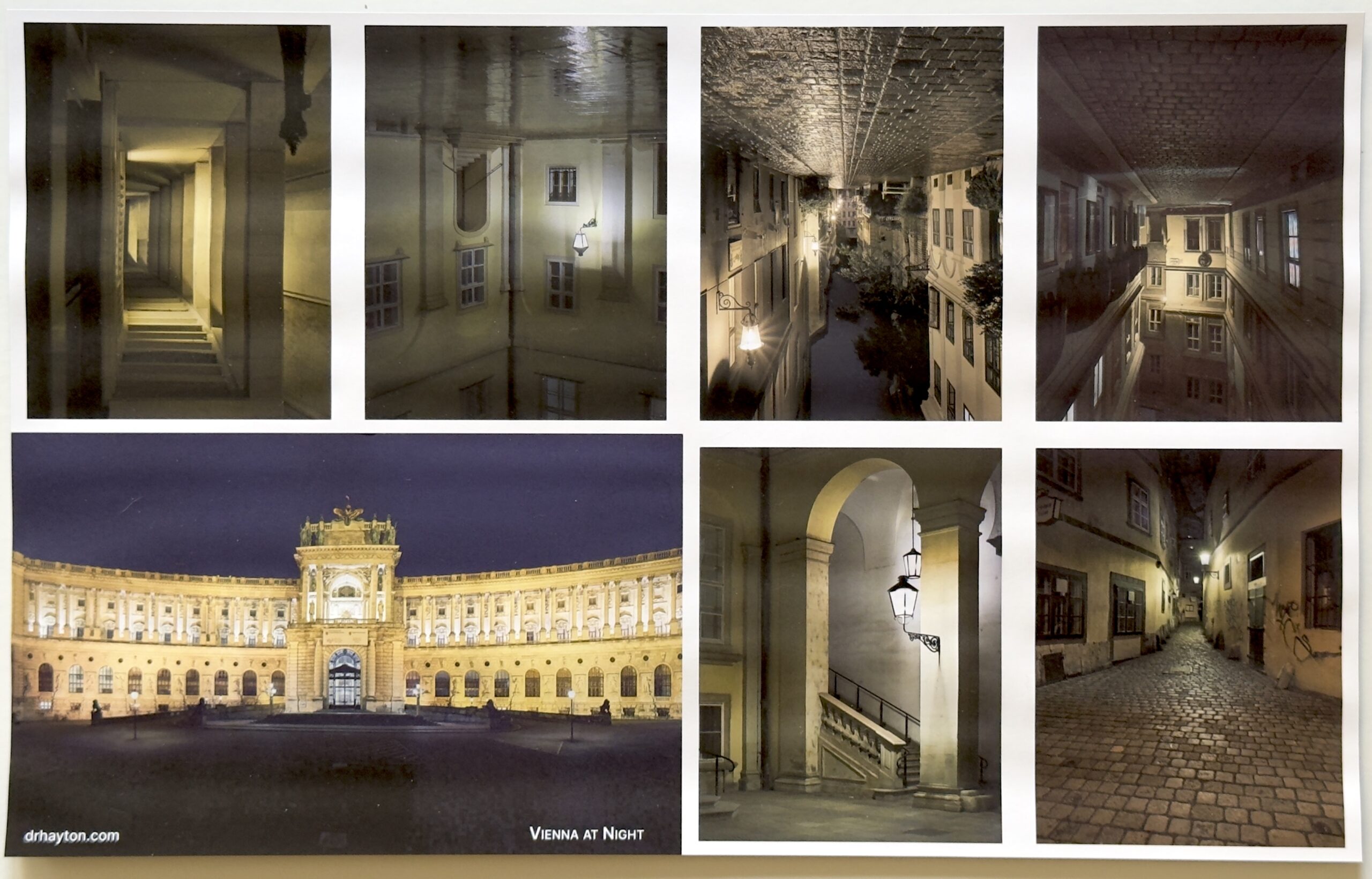
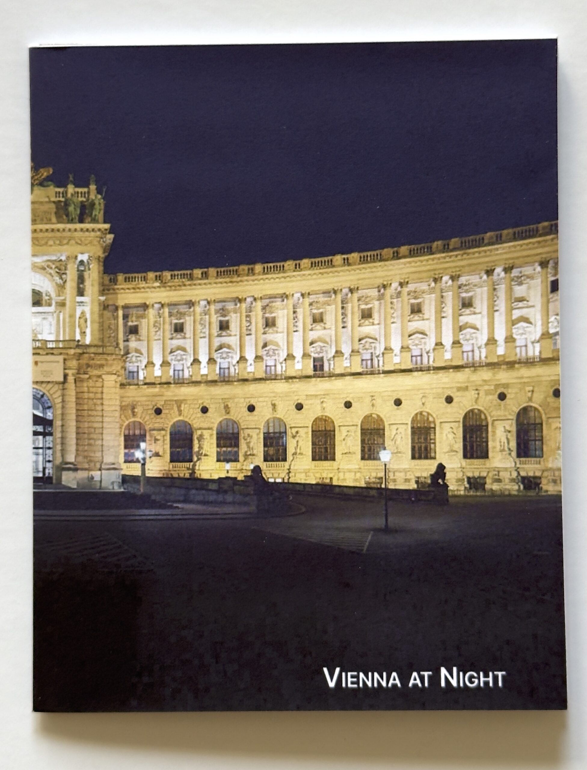
The “Vienna at Night” zine before I folded and cut it.
This format also gives a place to print a large photograph on the back side. It’s sort of a surprise for the person looking at the zine, and a puzzle — it seems unfolding and refolding the zine presents something of a challenge for people, which I didn’t expect.
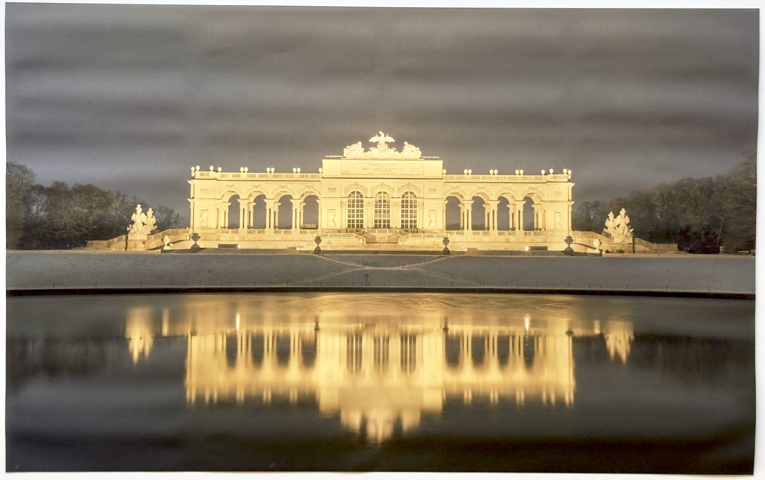
A picture of the Glorietta that is the central image of the zine “Vienna at Night”
When it is all done, trimmed, folded, and cut, the zine is the perfect size for my guerrilla art projects. I have given them to friends and handed them to people I don’t know, left them on tables and shelves in coffeeshops, stuffed them between books in libraries and bookstores, and left them on seats in buses.
The cover of the “Vienna at Night” zine.
I don’t know what happens to those I abandon in the world. And I don’t really care. The point, for me, is in the making and giving away (not, I stress, “sharing” which has become an essential part of the economy of likes, has become entirely transactional, and depends on knowing what happens to whatever you make).
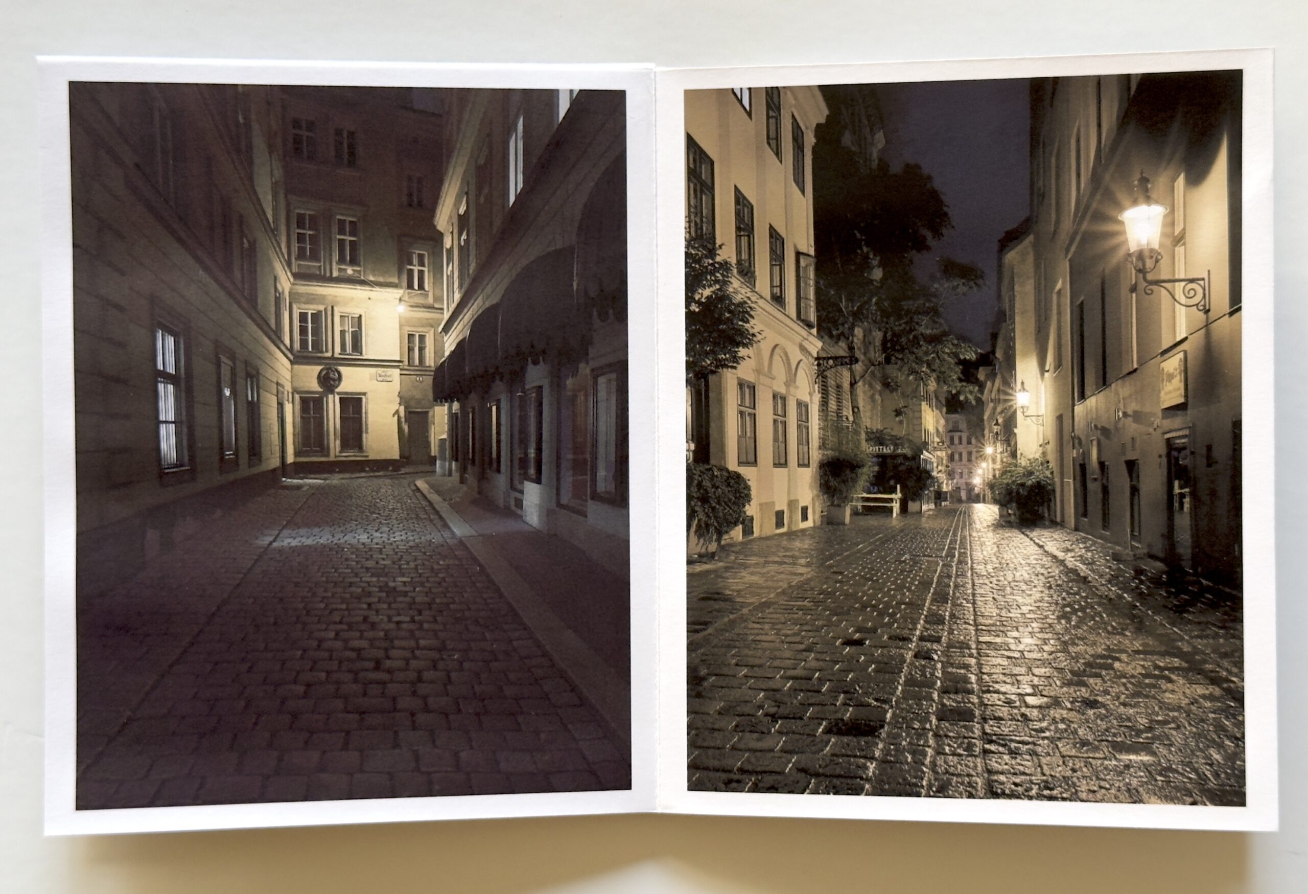
Two of the pages in the “Vienna at Night” zine, after I folded, cut, and pressed it flat.
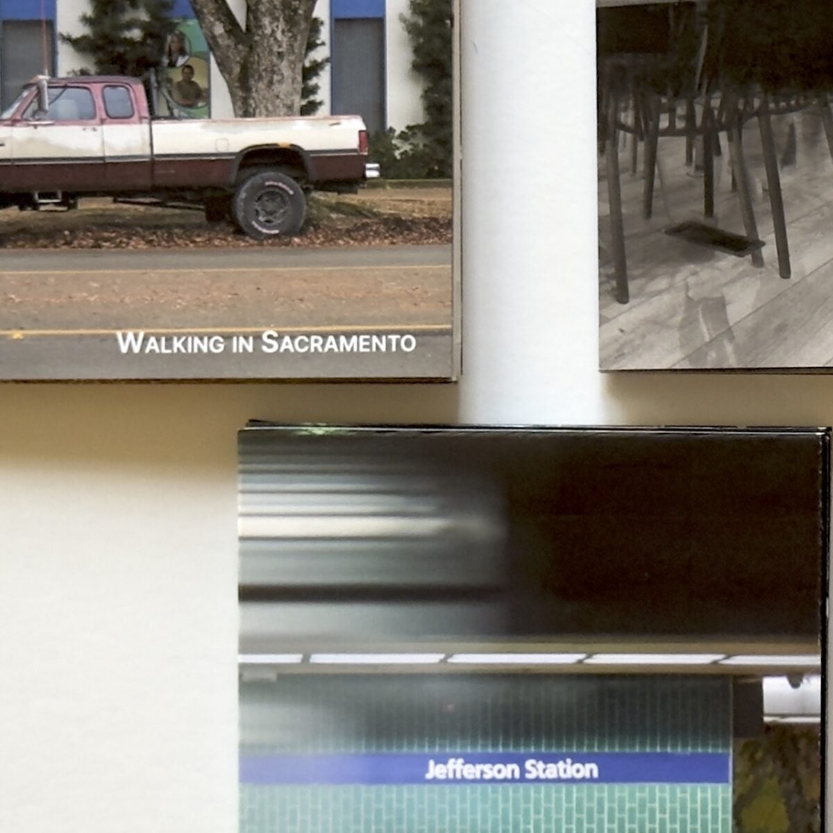
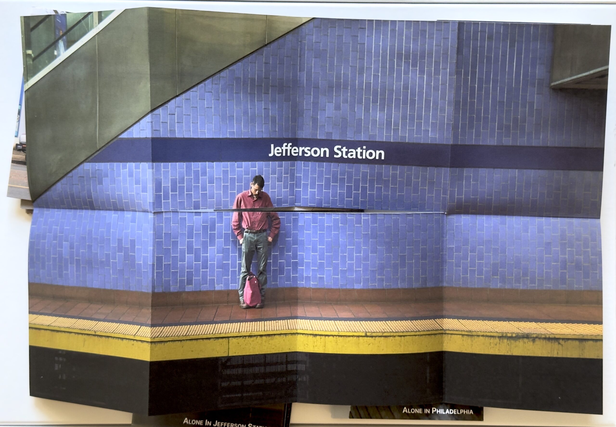
Sometimes I leave the house, camera in hand, looking for a coherent set of images that work well together. That was the case with the “Walking in Sacramento” or the “Alone in Philadelphia” zines — I knew an afternoon’s walk would produce at least 8 scenes I could cobble together into a zine. Other times, I draw from a few trips out and about, as in the “Vienna at Night” zines (there are two of these zines, gathering together the photographs from a few nights wandering the city late at night). In other cases, a zine emerges when I’m looking back through photos I’ve taken over a number of trips out. “Alone in Jefferson” is that type — the central image is part of a collection of photographs I’ve taken usually in Jefferson Station that highlight the loneliness of the modern world.
The central image for the “Alone in Jefferson” zine.
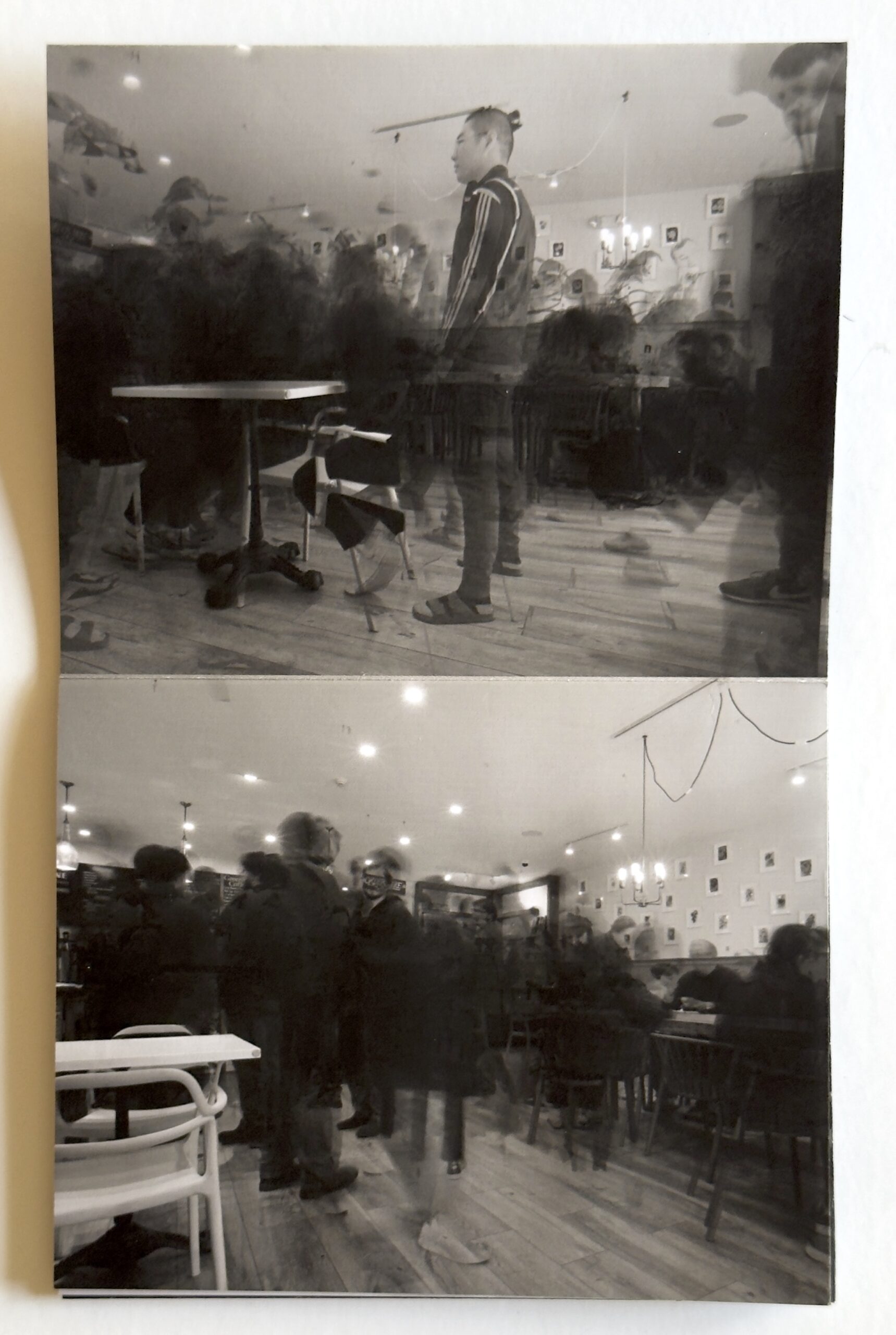
Any group of 8 photographs that cohere can become one of these little zines. Inspired by Alexey Titarenko, I took a bunch of photographs of people in a local cafe (see Ghosts in the Cafe). Turns out I have 8 that work well together, so I printed them as a zine. Seems appropriate that I left a handful in that cafe.
A spread from the “Ephemeral” zine.
Like all of my projects, this one will last as long as I find it amusing or interesting. I will continue to print copies of these zines, and cast them into the world. If you’d like to receive a few, send me $10 and your address. I will send you three random zines. Or, offer something in exchange.
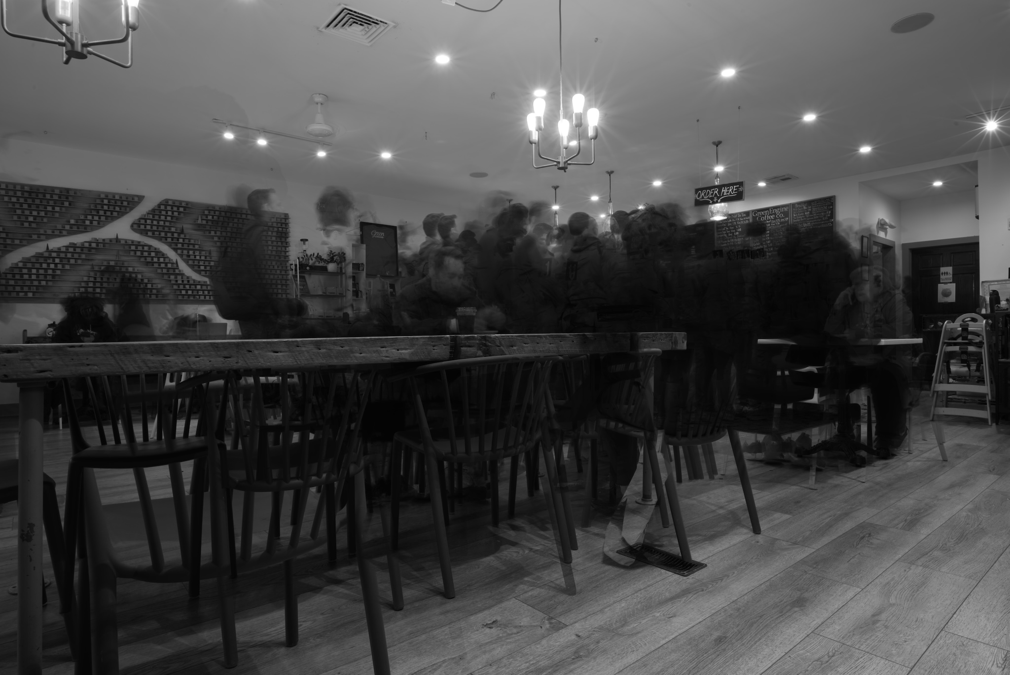
Lately I have been inspired by the long-exposure photos of Alexey Titarenko. I think his “City of Shadows” is beautiful and haunting. To be sure, some of my fascination comes from my fascination with 1990s St. Petersburg. Nonetheless, I find the images lovely. So I thought I would try some long or, in this case, multiple exposures
Urban #230911.
The local café is convenient and has reasonable coffee, so I am practicing there. I like the look, but need to find a better location. I should head into the city one night. Maybe if we get snow this winter. I have some places in mind that will, I hope, look good.
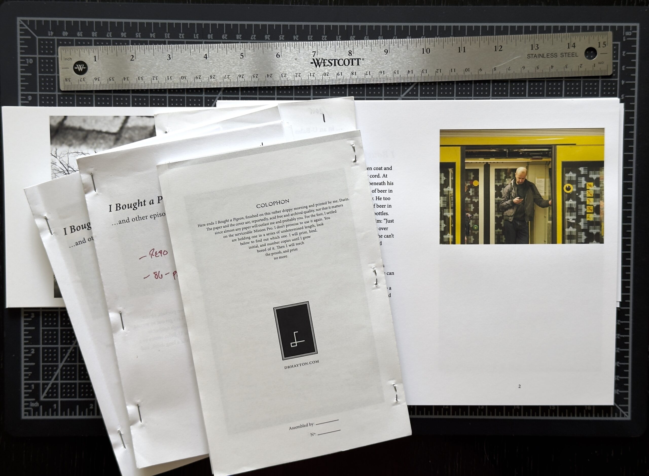
I recently finished another book project, “Fragments Red.” This volume will be the first of a seven-volume project, each pairing photographs with reflections of different sorts.
Working on the first volume of Fragments. The fourth draft.
A handful of drafts, each with a number of changes. Then there was the layout and design issues, where to put gatefolds, how to bind them, solving pagination issues. It was all so much fun.
A pile of drafts of volume one of Fragments, and some early printed pages.
After I spent a evening or two printing the pages, I made a jig to make drilling the holes in the pages easier and consistent. Then I painted some covers, found some matching thread to use for the binding (a version of “Japanese stab binding”), and sewed them up. Soon I had a dozen or so booklets.
Final copies of Fragments Red, with hand-painted covers and hand-stitched binding.
It took a long time, but I find something so satisfying about making something. Now off to start working on volume two, Fragments Orange.
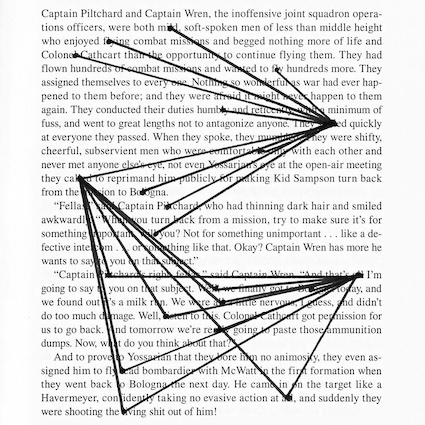
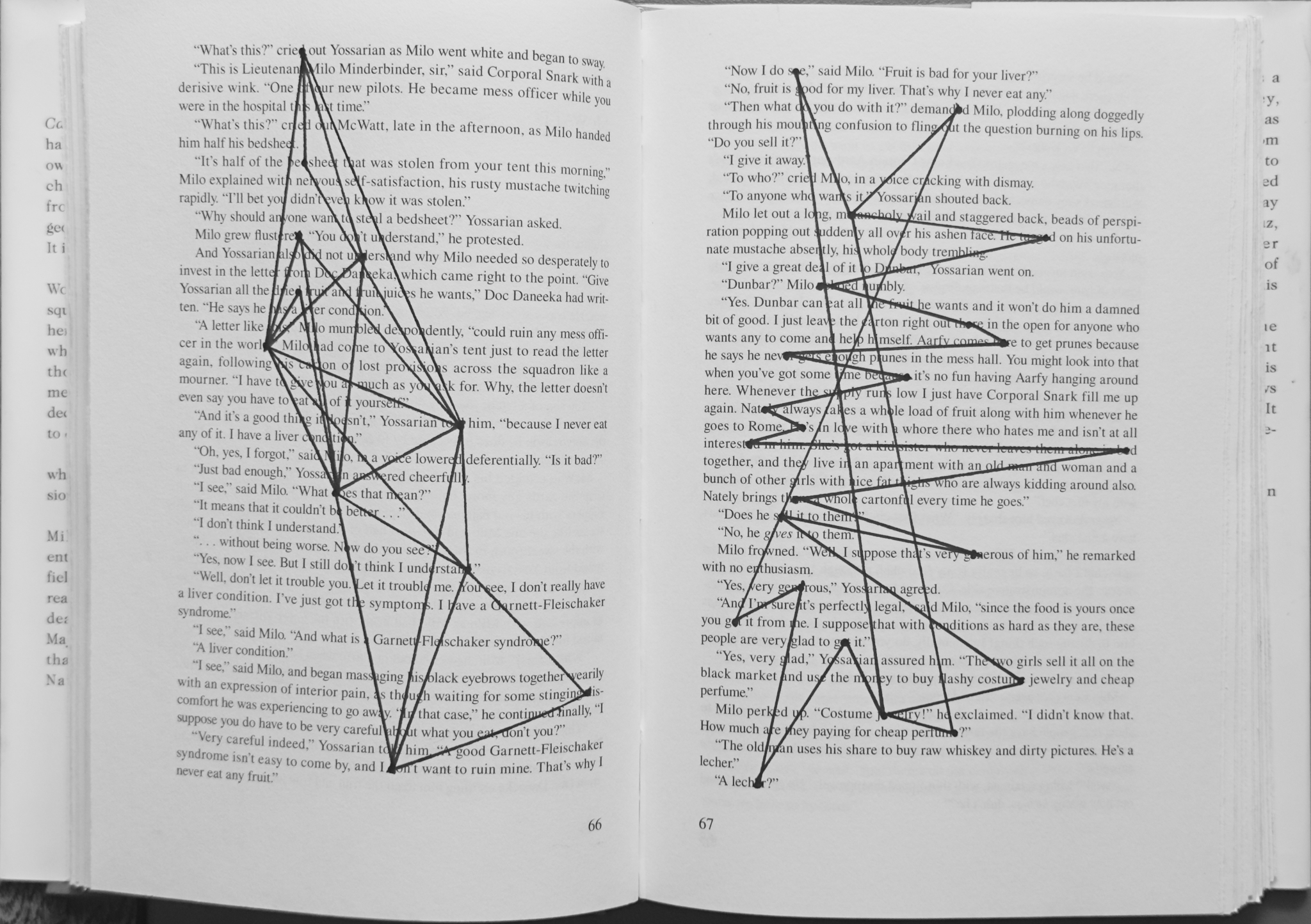
Consistency is important. Consistency not in the sense of making the same thing or even the same type of thing, but in the sense of making something. Doing something with my hands. Anything. Lately, I have occupied my hands and my mind by using books as an inspiration for a type of drawing, something called “entopic graphomania.” I came across it in Playing with Sketches, by Whitney Sherman, though there are lots of other accounts, e.g., “What is entopic graphomania.” It is quiet and feeds a certain type of creative need.
Creativity need not be profound. Here are a couple pages from a copy of Catch-22 that I used for some “entopic graphomania.”
Like so many creative practices, my approach changes over time. These early examples seem now, to me, to be rather rigid and spare. More recently I tend toward busier drawings. I have also found ways to add layers to the process. So now the drawings within a book speak to each other.
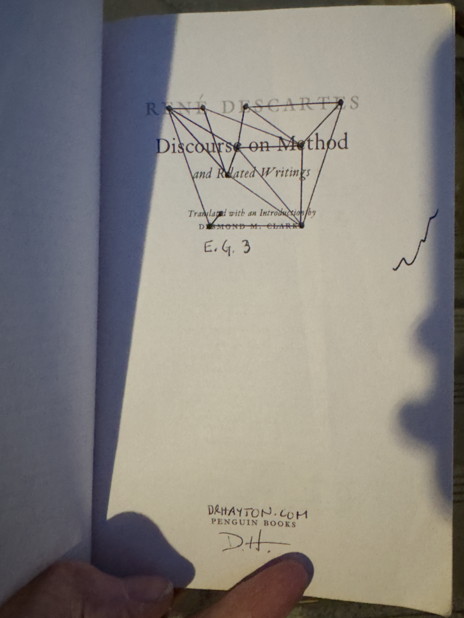
Descartes “Discourse on Method” was a handy canvas for some entopic graphomania. I ditched it in a bookstore.A modified version of Descartes’ “Discourse on Method” waiting for somebody to find it.
And as with all my creative efforts, the process doesn’t end with the making. I cast them into the world. Little Free Libraries, bookstores, libraries, benches are just some of the places I have left copies. Maybe somebody else will stumble across them and try to make sense of them.
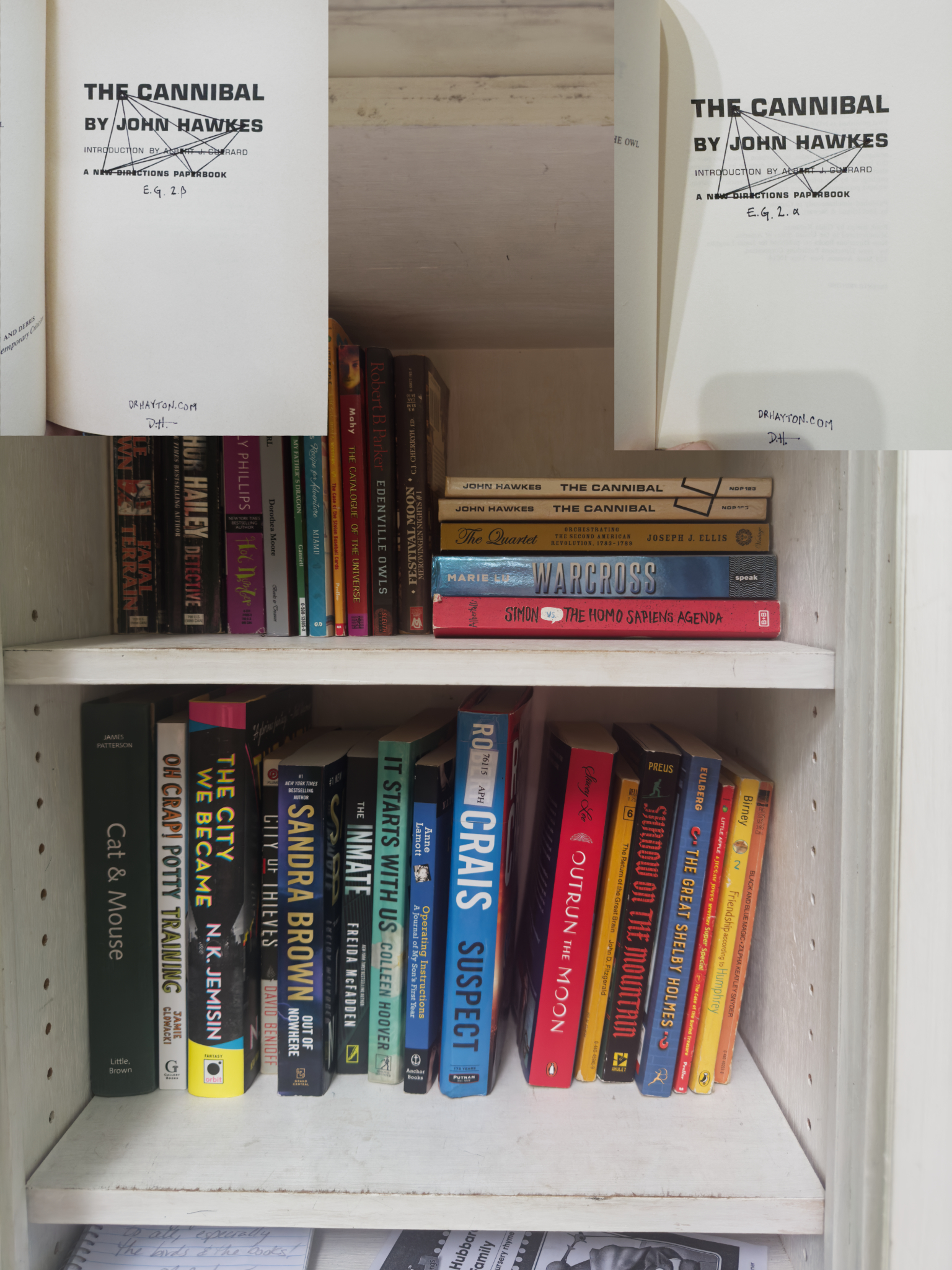
Two copies of John Hawkes’s “The Cannibal” stashed in a Little Free Library for somebody to find (both have since gone away).
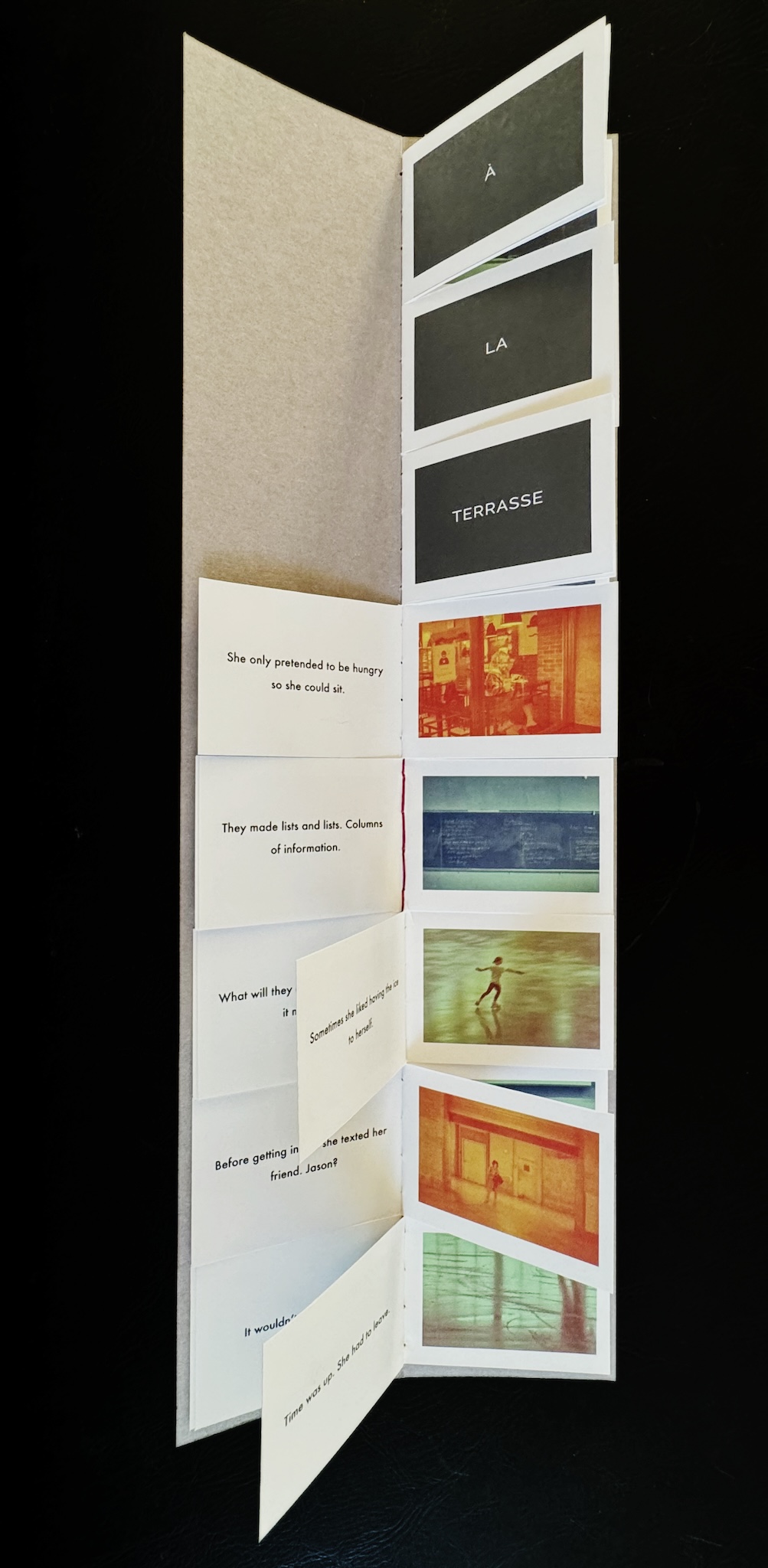
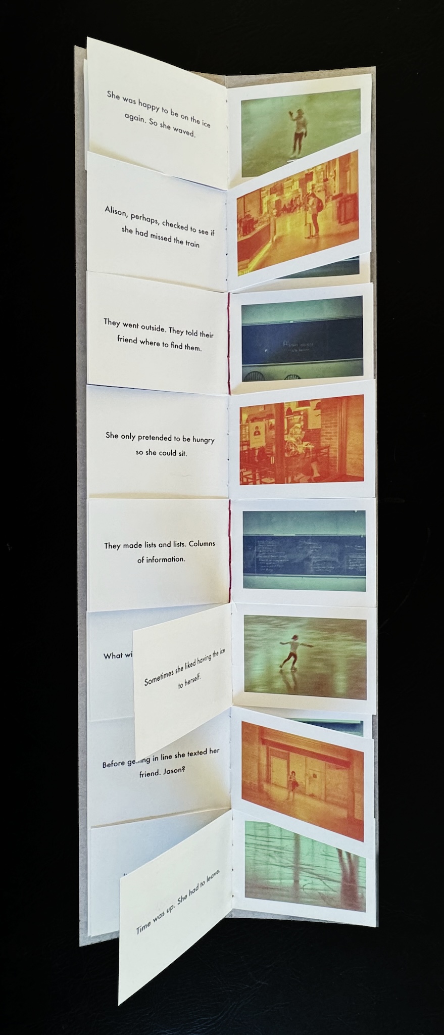
I often think of photographs in collections or series, linked to a single subject (e.g., an idea, place, time, experience). Given my preference for printed, physical photographs, I increasingly try to imagine a project in the form of an artist’s book. Artist’s books are not restricted by the format of a traditional book, sequential pages glued (or sewn) together. Instead, an artist’s book gives me the chance to play with form (accordion books, folding books, etc.). By taking advantage of these different forms, I can encourage people to imagine different ways to think about the relationship between photographs.
PBα #0.
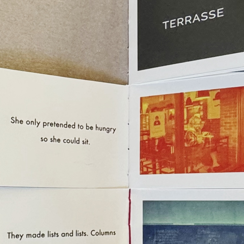
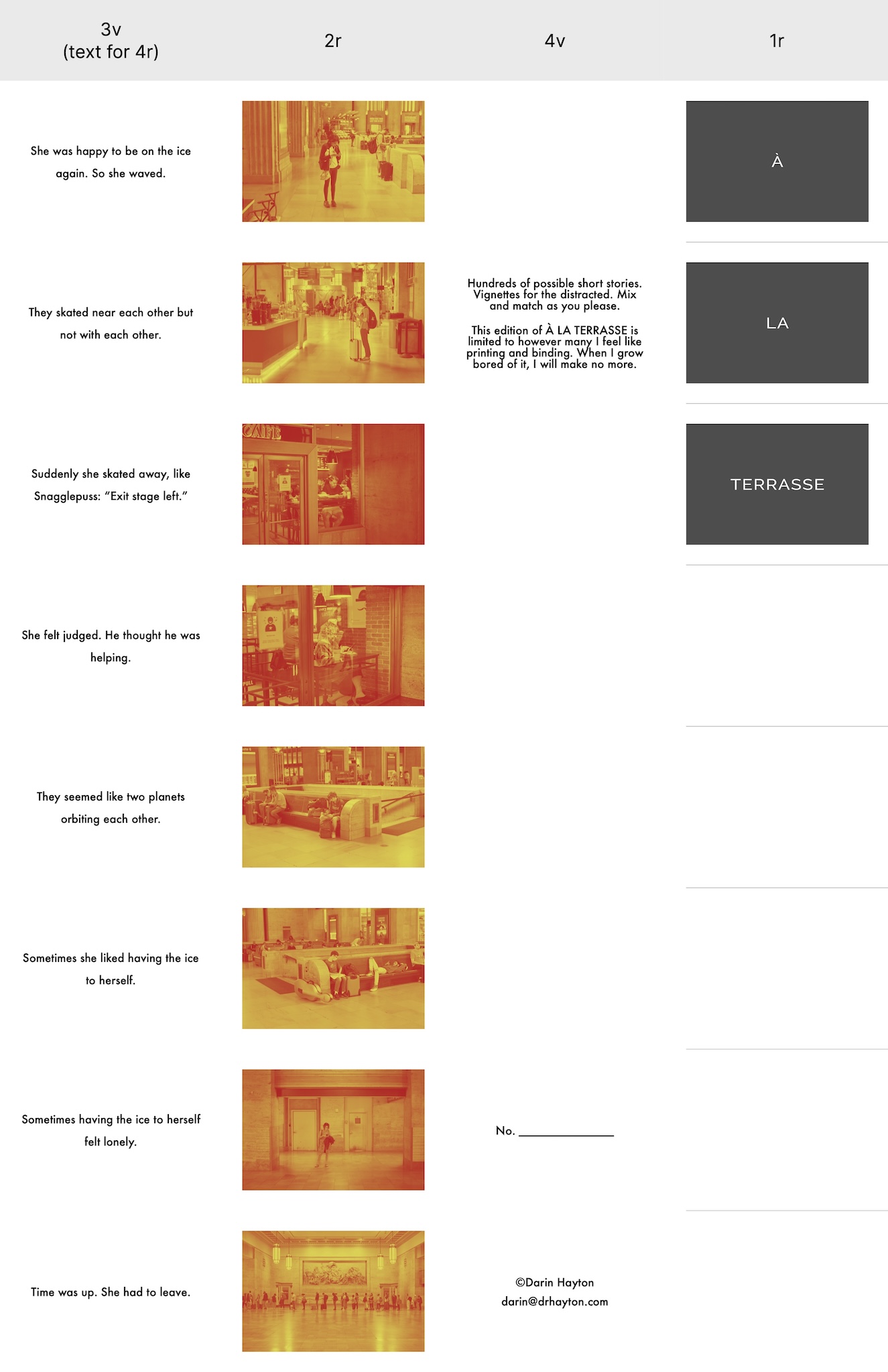
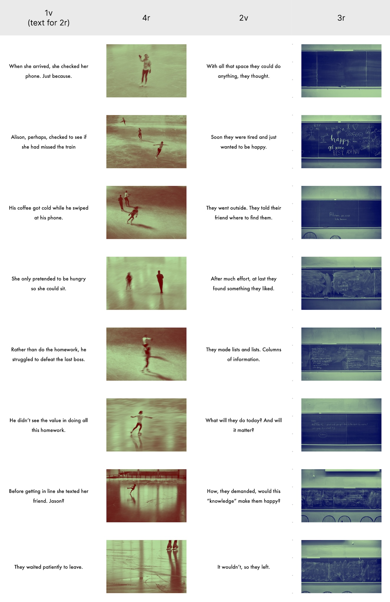
Recently I was playing with what I’ll call a “panel book” (“flap book” or “flag book” might be good terms as well, but let’s not dwell). In this initial experiment, three series of eight photograph-sentence pairs are arranged so that the reader can flip through each panel individually. The reader creates the series by flipping between photograph-sentence panels.
PBα #1.
The book is an unusual shape, very narrow and tall at 2.75″x16″. The pages are stitched together inside a heavy stock cover. The paper I used for the pages was a bit thick (fortunately, I have since purchased some thinner paper). It took some planning to get the layout correct so that the printed pages would be in the correct order when folded and sewn. But now that I’ve figured it out, I’ll certainly be making more — I’ve already got PBβ planned.
I don’t quite know how Hopkins meant this comment. His poetry suggests, to me, that he meant he didn’t write popular verse. He wrote for an audience of one or maybe for no audience. He wrote what he needed to write and didn’t give any thought to how people might read it.
Urban #231223.
Hopkins’ comment pairs well, I think, with a poster I saw the other day:
it’s not always about what you make, but the fact that you are creating.
Today’s economy of exposure demands that we create in the hopes of gaining validation from some imagined audience of potentially thousands. Succumbing to that demand prevents us from making the things we want to see and risks constraining our collective creativity.
Repeat as needed: Be comfortable enough with yourself to create what you need to create. That’s what matters.