The boundary between me and the world is about 12 inches wide. But in that 12 inches there is another, if smaller, world. Shadows cast by light falling across various things sitting on the window sill. Shadows that shift and change over the course of the day, the weeks, the months.
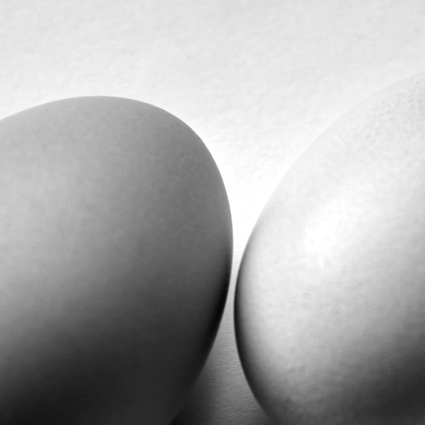
Still life #221106.1
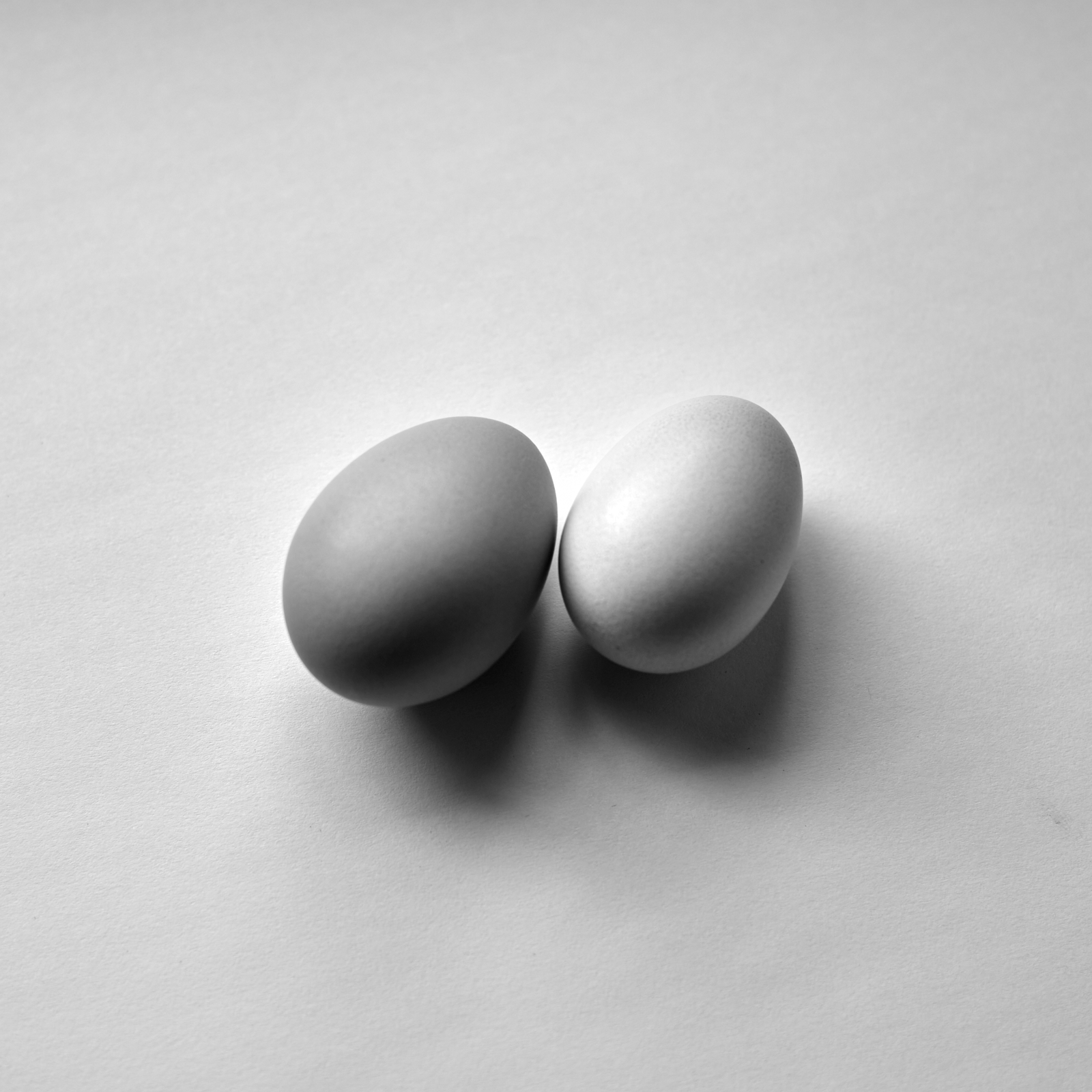
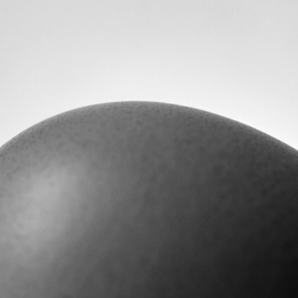
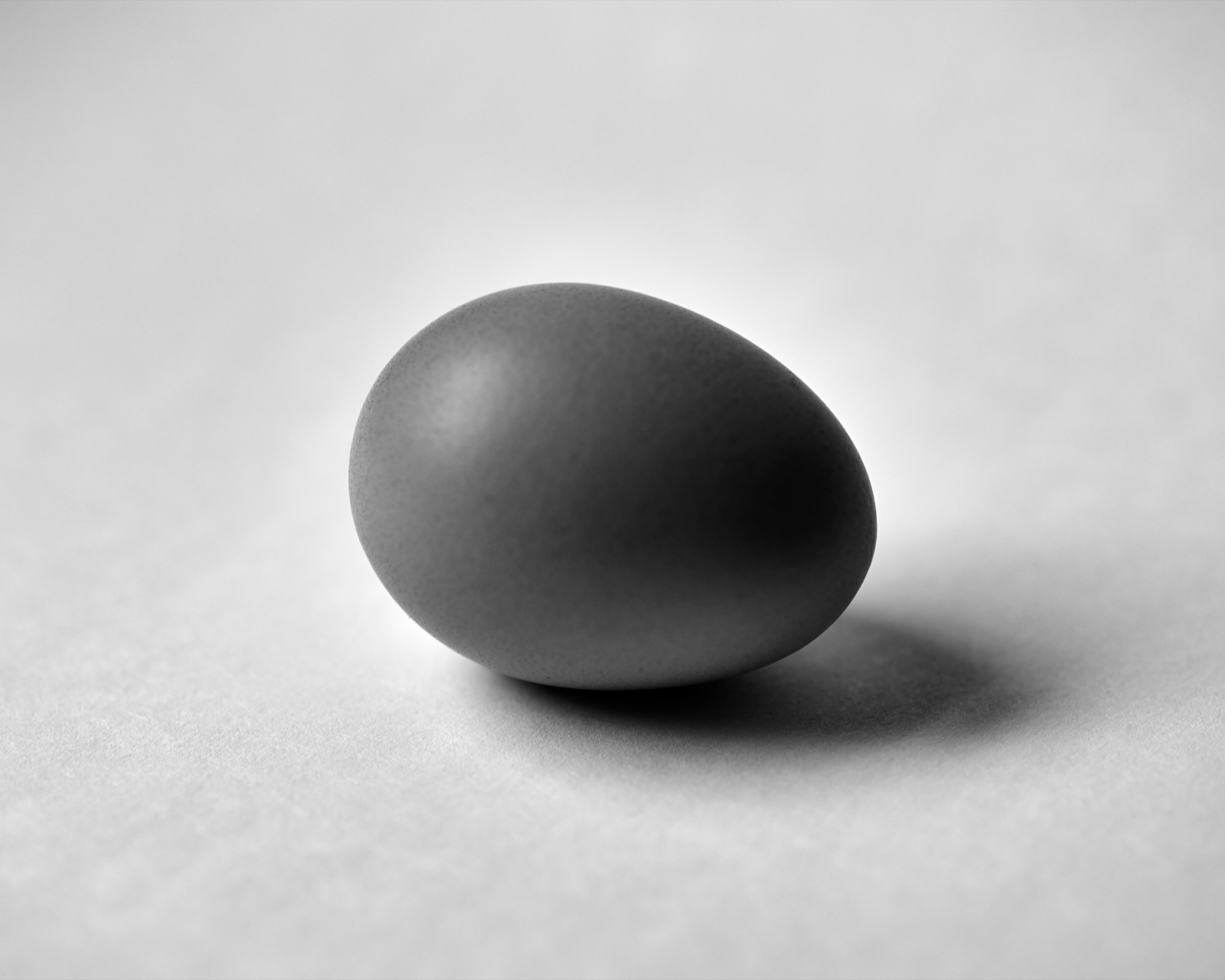
Two eggs from the neighbor’s chickens. Hardboiled. Lunch if I remember. Now and then I glance over at them, like small sundials tracking my time here on earth. Empty glasses and coffee cups, evidence of having done something. Bottles of different sorts. Strangely, no flowers or plant life, for reasons I can’t explain.
Still life #221106.2
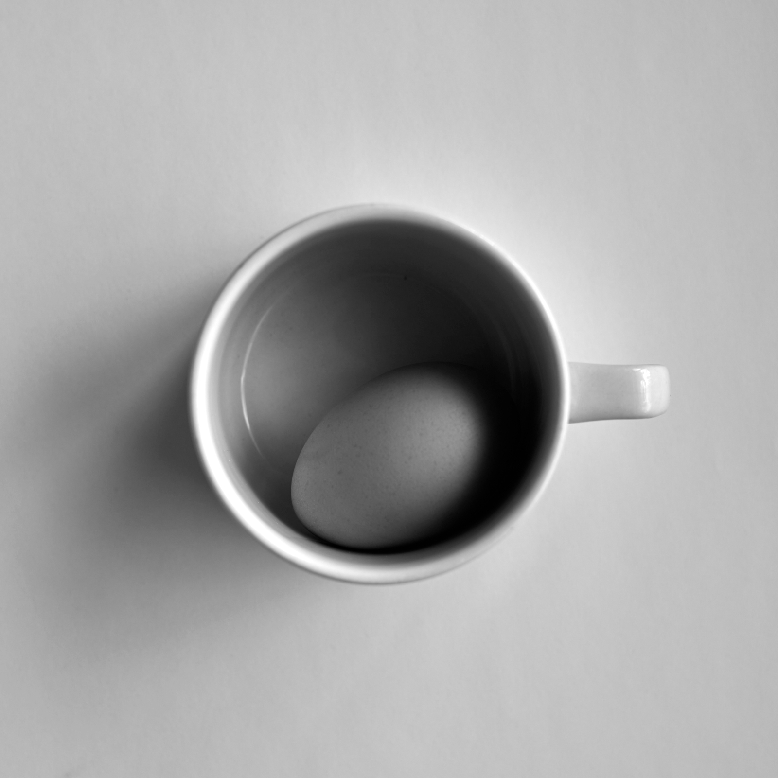
Some cups get repurposed, a tiny coop that keeps an egg from rolling off the sill and onto the floor. I see now how Sudek was able occupy himself with nothing more than a window and the things around him.
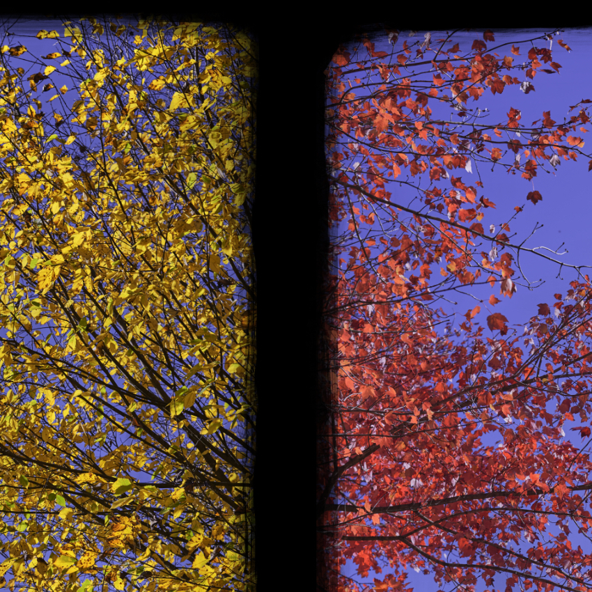
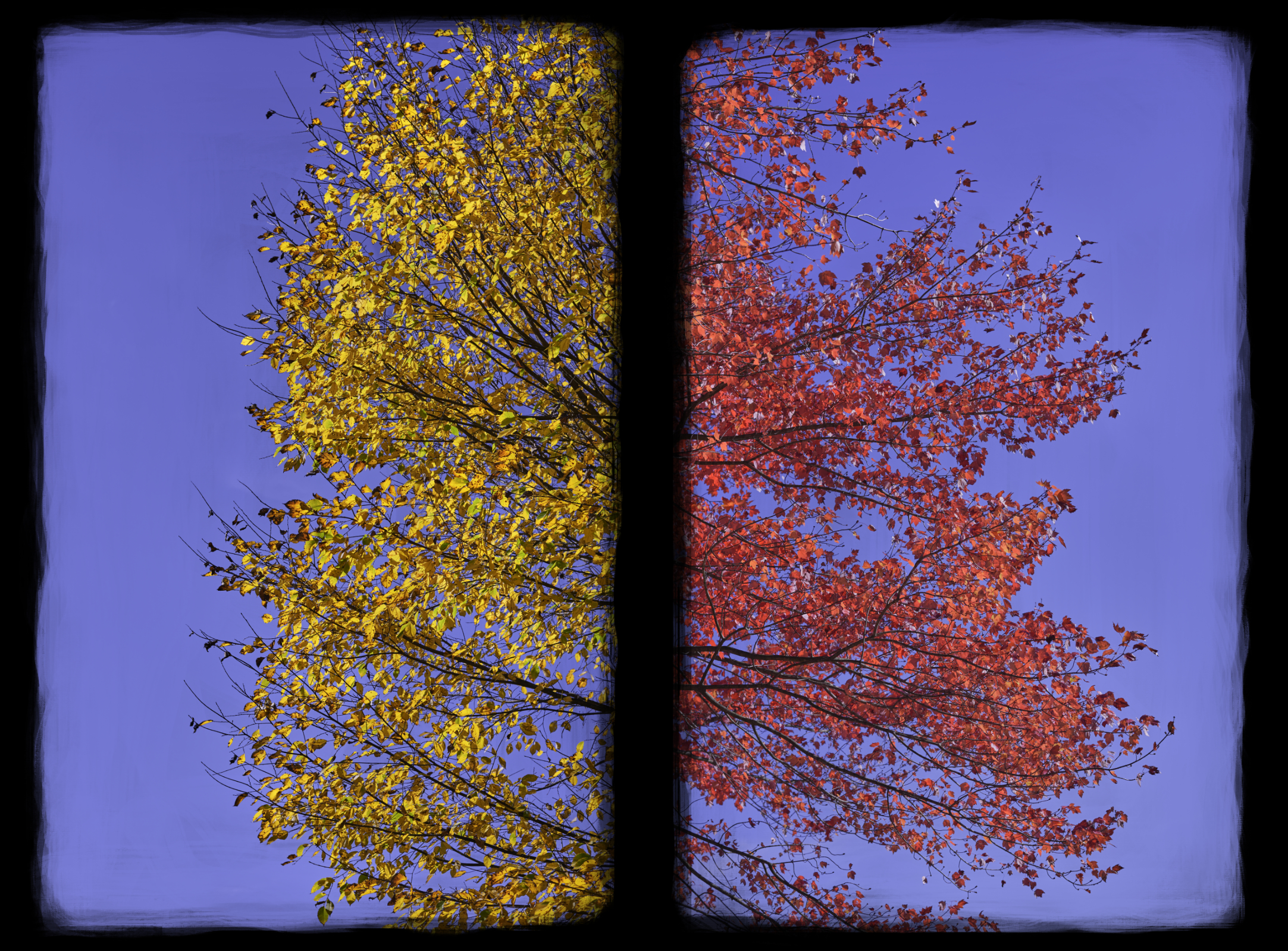
Diptychs (and triptychs). Thinking about photos in groups: twos, threes, and fours, maybe more (the grids of photos by the Bernd & Hilla Becher, e.g.). How does pairing photos change them? How does looking for pairs alter the process of photographing? I don’t know, but I like to think about it.
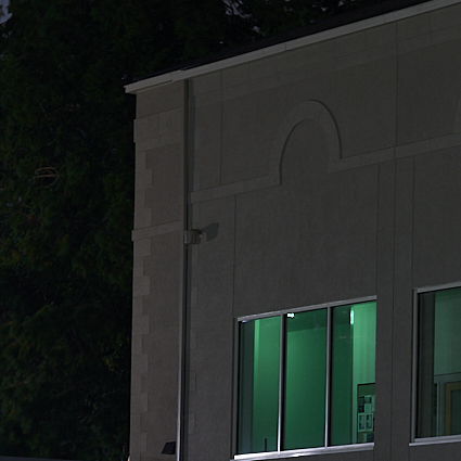
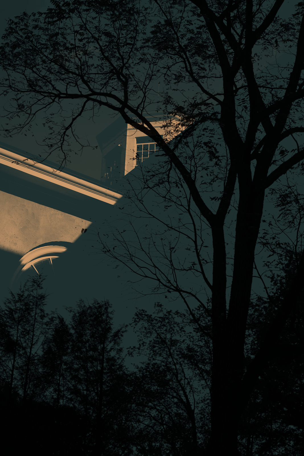
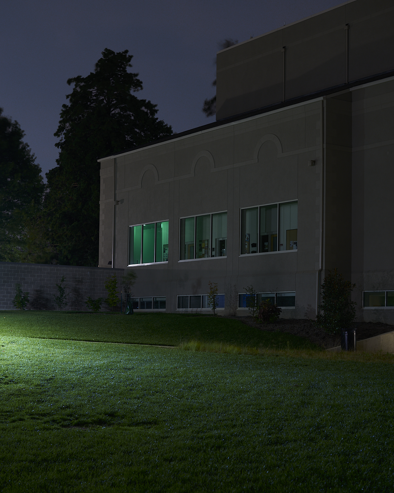
Most days Haverford College is idyllic and lovely, and therefor kind of bland. Beautiful trees, manicured lawns, clean buildings, maintained nature trail. It is all so picturesque, so “park like” as somebody said yesterday while looking at a large maple tree resplendent in fall colors. But is there another way to see Haverford, one that is not so bright and cheery?
Urban #221011
I enjoy photography because it encourages me to see the world at different times and in different ways. I can juxtapose images and scenes to give a different impression. Or I can seek out scenes in different circumstances and conditions, allowing me to see them in ways most people won’t.
I often feel trapped in my office, looking out at the world having fun. The tree blowing in the breeze, the sights and sounds of kids playing, the occasional snippets of conversation between people huddled beneath my window talking about something they hoped to keep secret. The window faces west. Lovely warm light streams in through the blinds each afternoon. Sometimes I raise them and look out. Sometimes I don’t.
Still Life #220925.2
I am not, of course, trapped. I can come and go as I please. But I work here and so spend most of my day in this office. It’s a comfortable space, filled with books and gadgets and notes and pens and old prints and scientific instruments. But always the outside beckons, especially in the afternoons when my motivation wanes. I stand at the window and look out.
Still Life #220925.1
The window becomes the interface between me and the outside world. Not a barrier but a liminal space where light meets shadow, a space where possibilities await. I linger in that space.
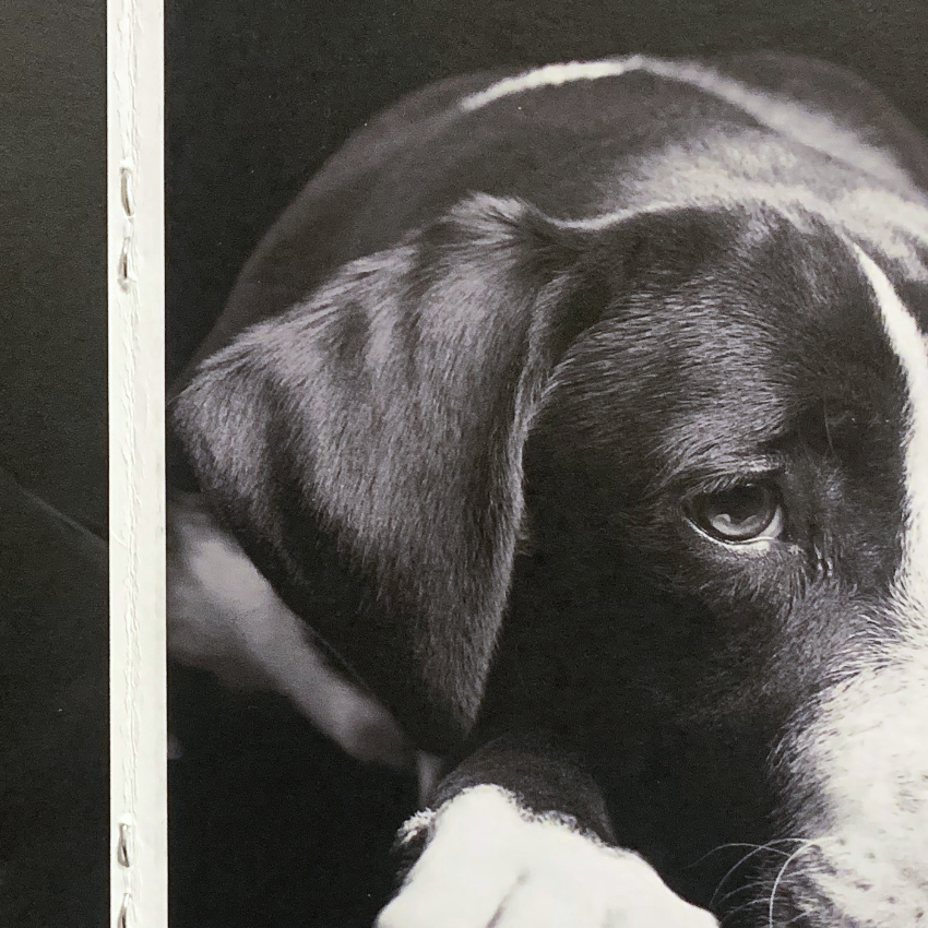
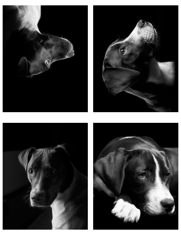
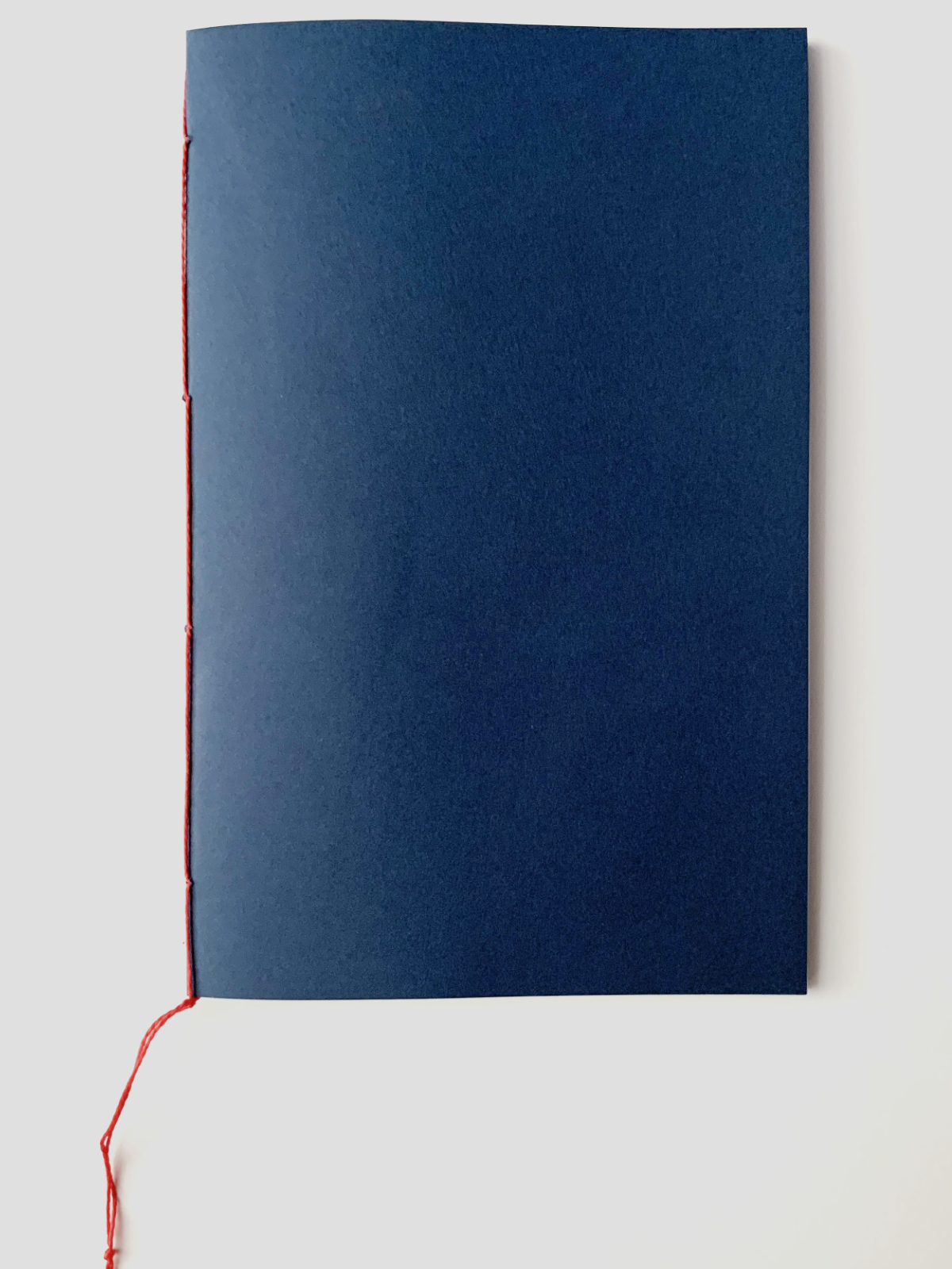
I often want to create something physical, usually cobbled together from stuff I have lying around. Nothing big, but something I can share with the world in some small but tangible way. I quite like pamphlets and hand-made books, little limited editions that I can leave for people to find. This time, a little pamphlet of portraits of dogs.
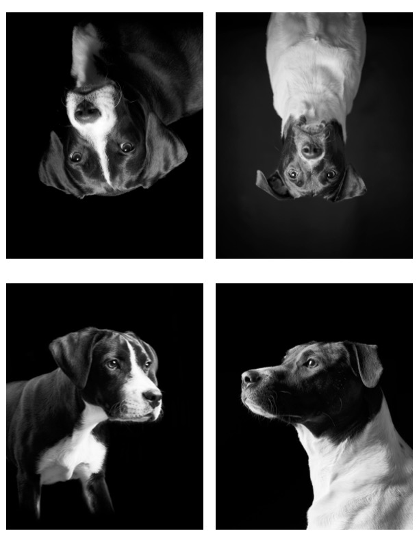
Side one of the sheet that I fold to make a 4″x5″ pamphlet.Side two of the sheet that I fold to make a 4″x5″ pamphlet.
After a few minutes with a publishing program I had the pages laid out so I could print them double sided, fold in half twice, add a cover, and staple.
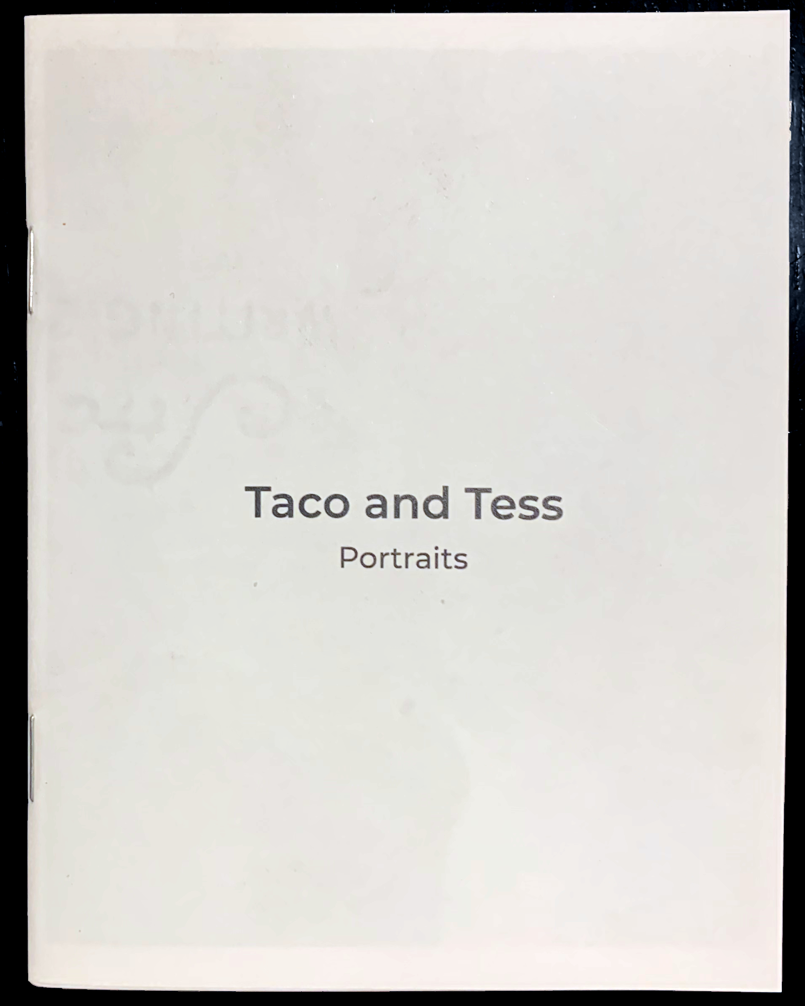
The cover for “Taco and Tess. Portraits” pamphlet.
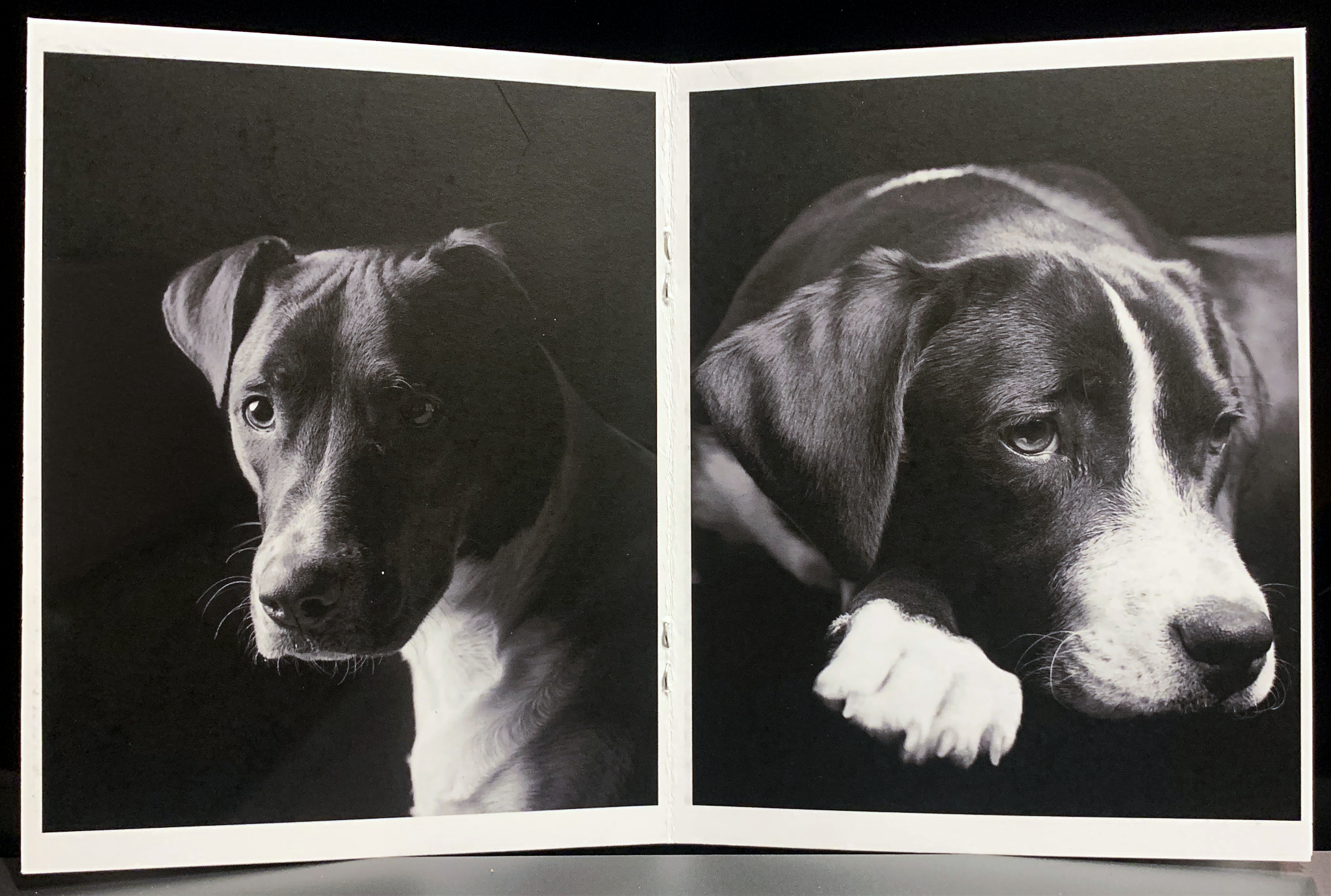
The center spread for “Taco and Tess. Portraits” pamphlet.
I don’t know who, if anybody, will take these pamphlets, and I don’t really care. Maybe somebody will just thumb through them. Maybe people will just move them around to get at the good books. It doesn’t matter. For me making the pamphlet was the goal.
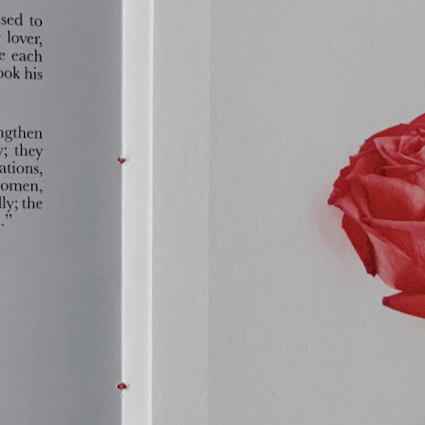
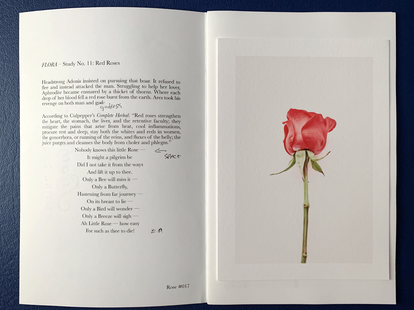
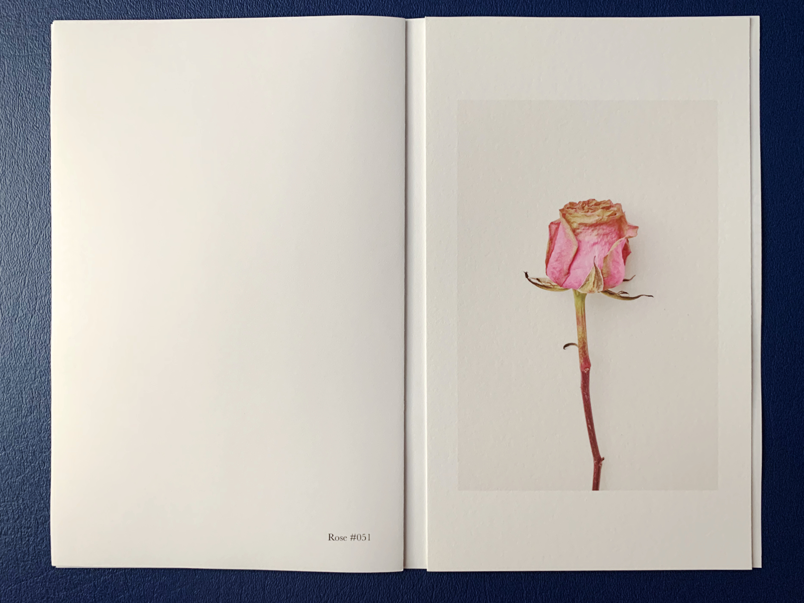
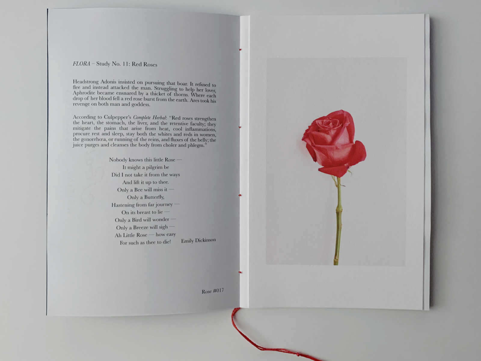
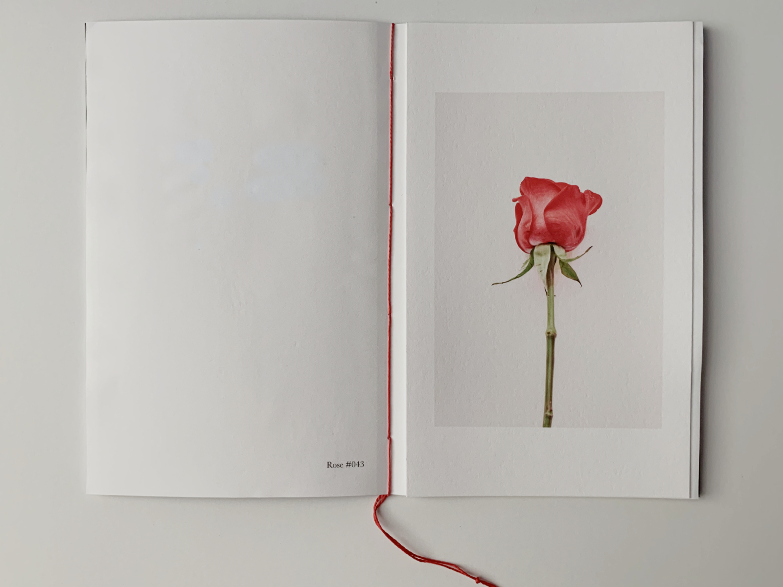
I have begun to sort my photographs of flowers into groups. I then print a few of the images and assemble them into little pamphlets, each organized around a particular flower. A recent pamphlet focused on a few photographs of red roses.
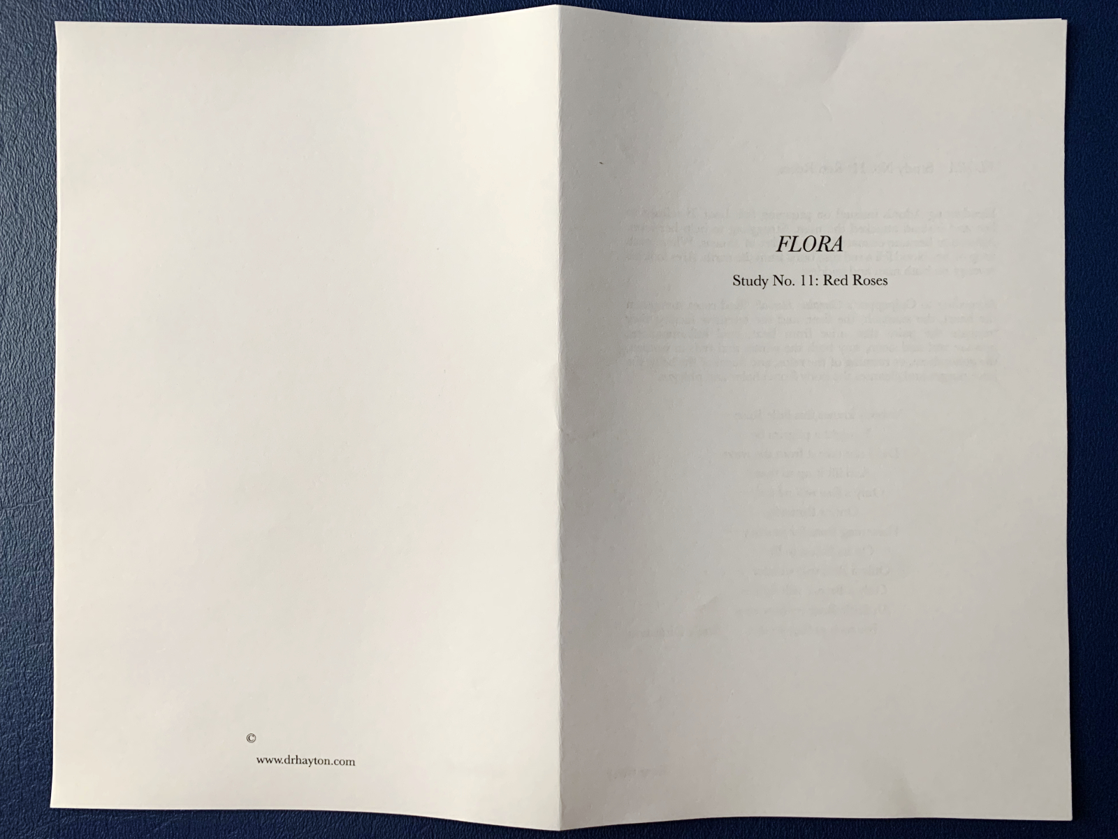
Draft title page and back page with colophon. Printed on cheap, copy paper.
Like all of these pamphlets, this one is short. Three photographs pasted onto the pages. Very little text, limited to the first page. And like all my book/pamphlet-making efforts, this one went through a handful of drafts. Revising the text. Testing different proportions for the photographs. Printing both the text and the images on different papers.
Marked up draft of a spread from a pamphlet I recently created.
I find the process fulfilling. Something about producing something that, for me, makes photography so much richer than locking it away in some digital prison where images go to die in the social-media doomscroll.
A spread where I test out a different size image. I like this one better.
The process it iterative and full of mistakes. How many times have I pasted the wrong photograph on a particular page (as above and below)? How many times have I misassembled the pages, or misprinted them? For any normal person, I’m sure this process would be frustrating. But for me the promise of sharing my work, giving something to somebody, even if I don’t know that person, nourishes my creativity.
Heavy paper cover of final draft of pamphlet.
This particular pamphlet/study grew out of a bouquet a neighbor gave us. They were out of town when their monthly flower arrangement was delivered. They told us to take and enjoy them. I photographed the roses from the bouquet as they opened and browned and wilted. I selected three photographs for this pamphlet.
First pages of pamphlet with corrected text and photo with longer proportions (in this draft I pasted the first two photographs on the wrong pages — oops).
I drafted some text that linked the photographs, and printed and bound the pamphlet, with red thread because that seemed best suited for the photographs.
Central pages, showing rose image and red binding thread (in this draft I pasted the first two photographs on the wrong pages — oops).
I left a copy in my neighbor’s mailbox as a thank you for the bouquet. She texted to let me know she got the pamphlet and loved it — that was kind of her to say.
I don’t know how many of these I will make, maybe a few dozen copies. These are another of the “limited editions” I create, prompted by somebody or something and limited because I think there’s a small and finite audience for them. But I’m always willing and able to print more. When I have enough of these pamphlets, I’ll print an entire set and bind them all together into a book. But that’s a project for another day.
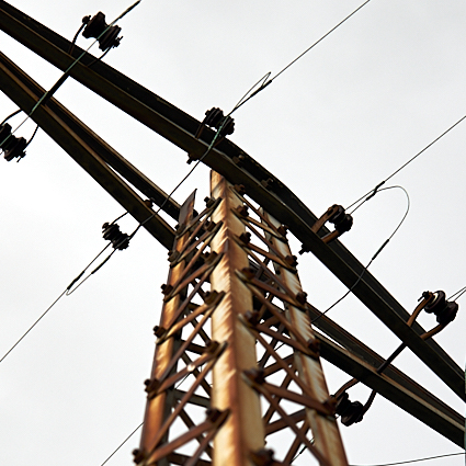
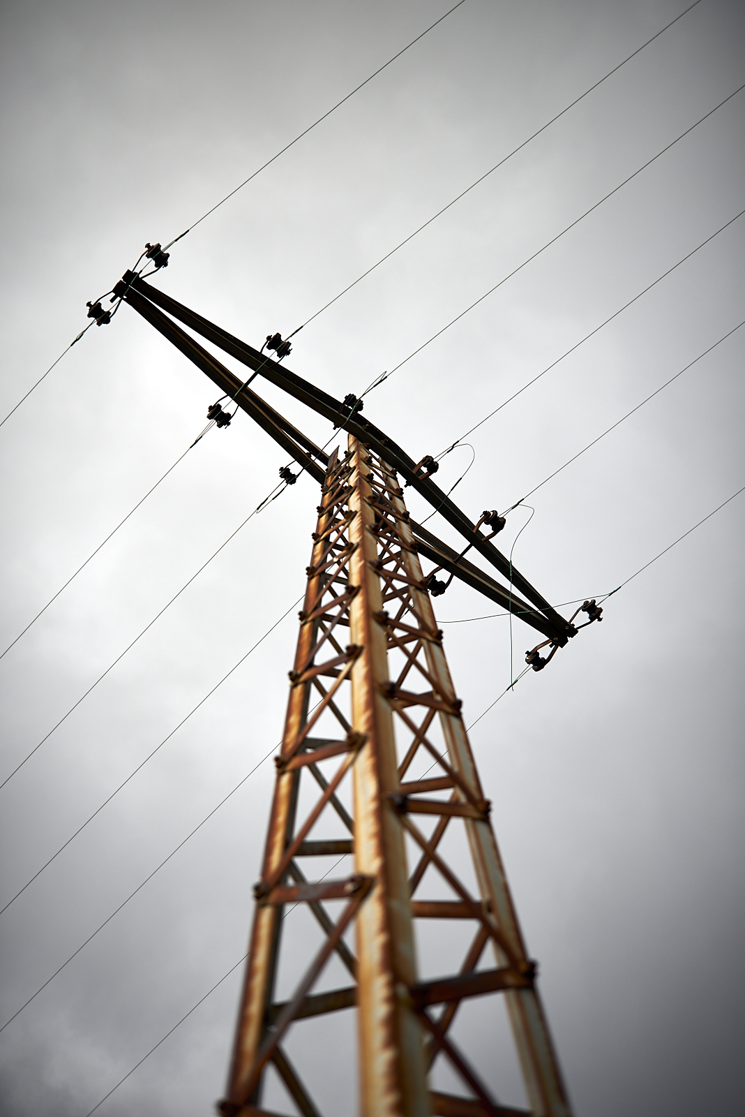
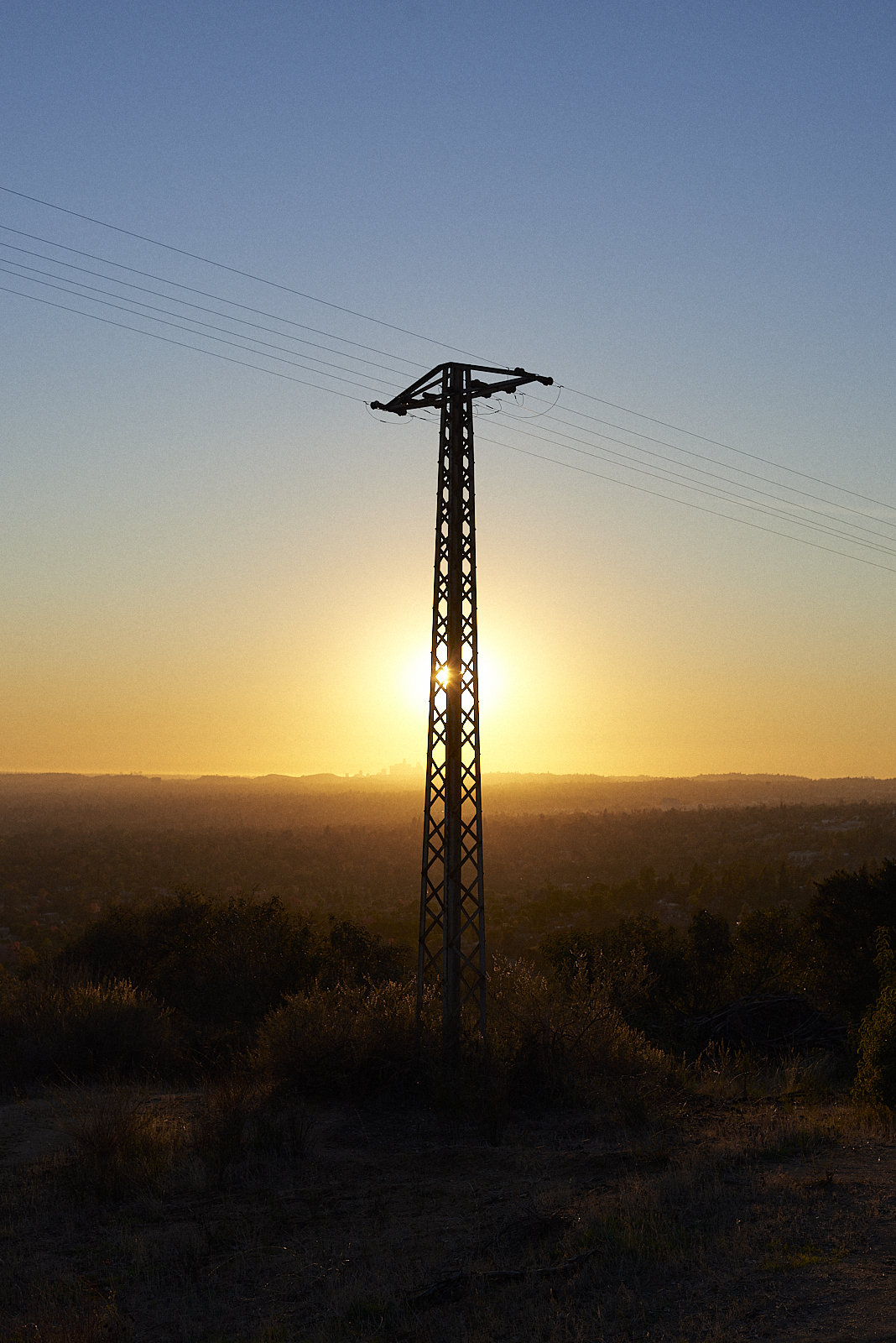
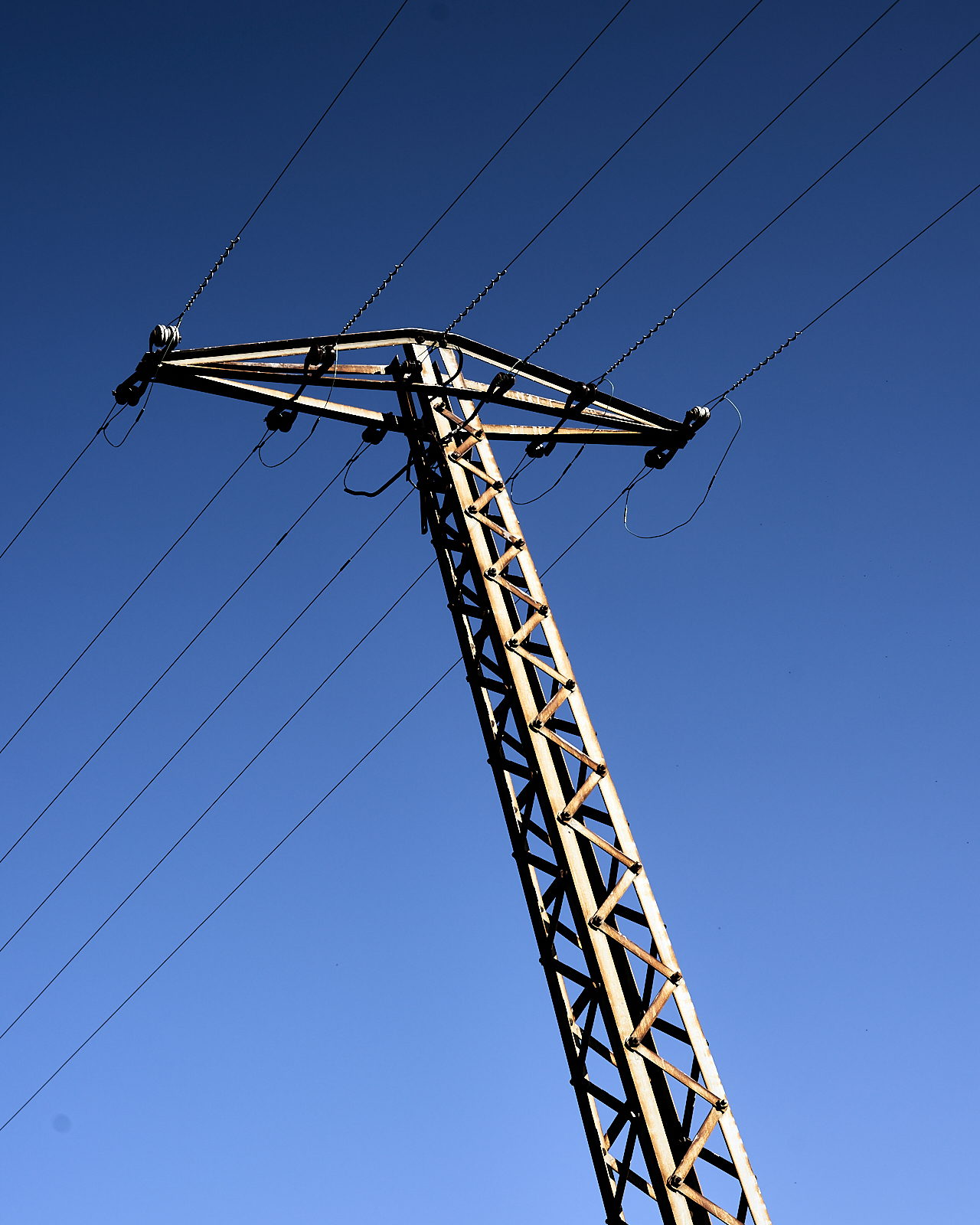
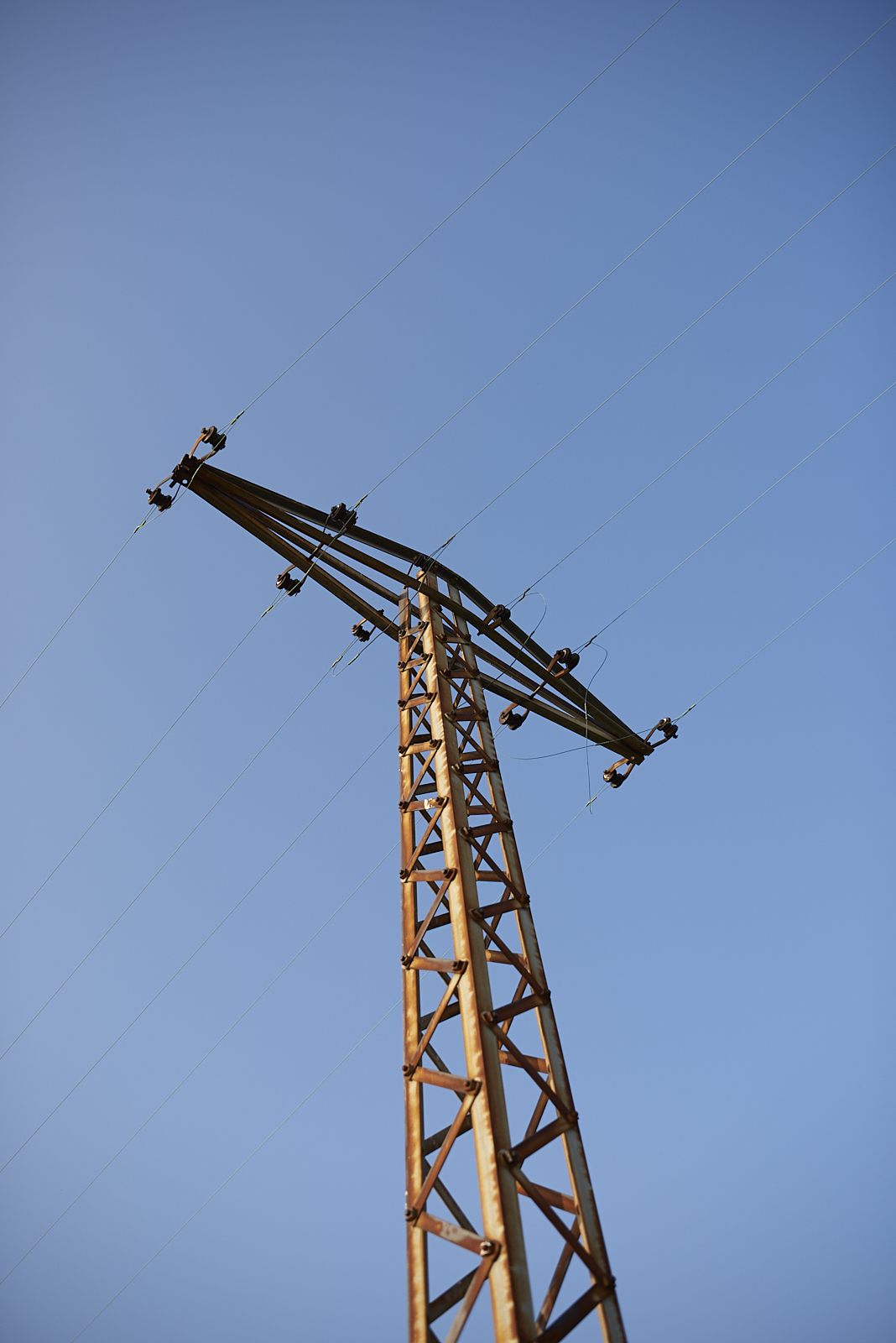
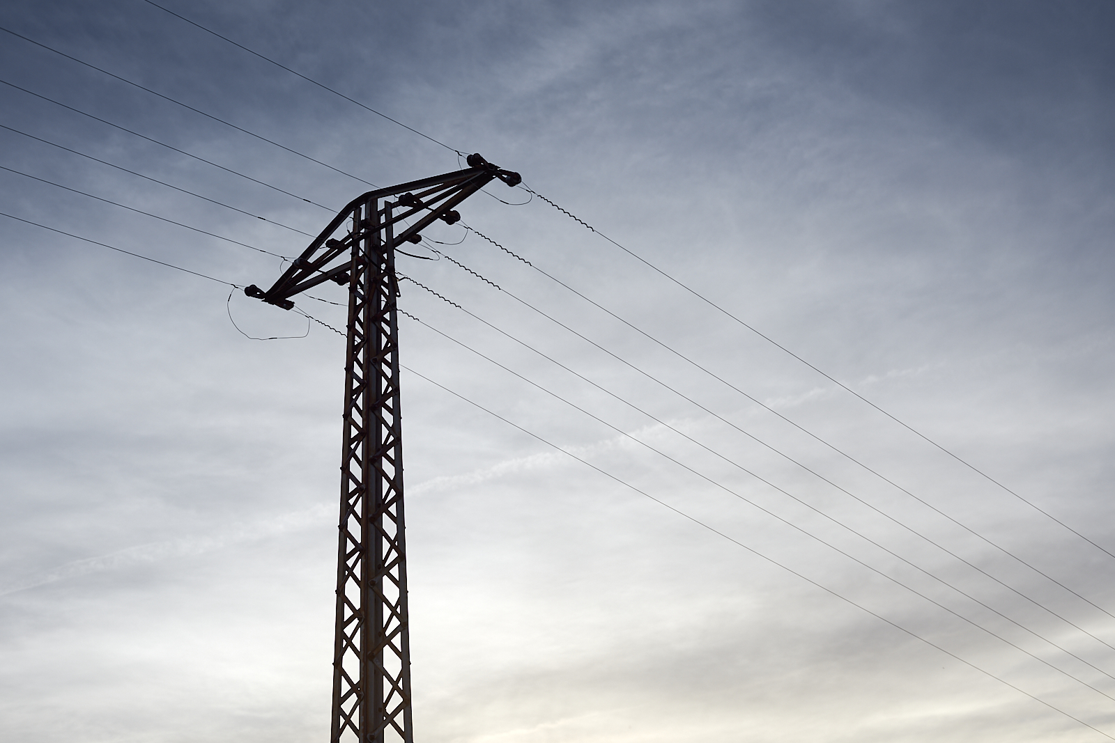
Along the ridge is a line of old power poles, serving a few houses tucked into the hills above town. Whenever I walk the trail past these poles, I photograph them, noting how much the scene changes at different times of day.
One day these poles will be gone, replaced by more modern, taller poles that bring electricity to the many houses that will cover the foothills. When that happens, at least we’ll have these photos to remind us of a simpler, less crowded time.
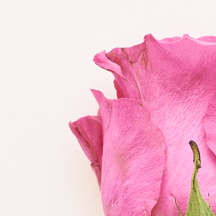
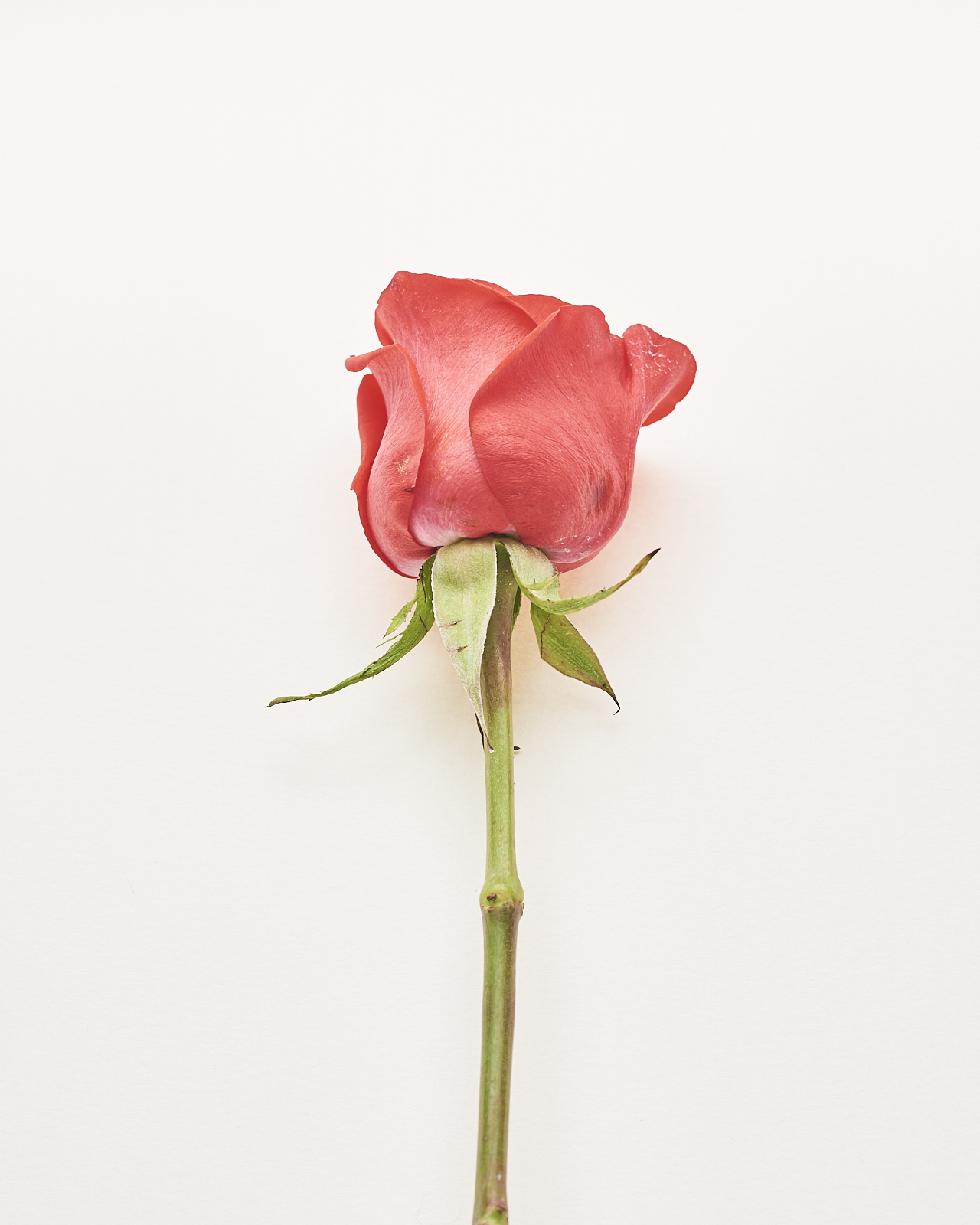
Flowers are powerful means of conveying emotion: condolences, loss, love, apology, friendship, thanks. Among the flowers commonly given, roses occupy a particularly important place, especially to express love. Yet, roses die quickly. Cut from the bush, placed in a vase full of fresh water, they last only a few days before petals brown and fall all over the table and the rose bud itself droops and becomes sad. A metaphor, perhaps, of the fleeting and fragile nature of romance.
#2200903.1: Study of Flowers 14.
Genetically modified and homogenized, grown in carefully controlled environments, today’s roses lack the variation, hardiness, and rich aromas of older varietals. 1867 and the tea rose. Today’s roses are standardized, like so many things in our world, even the ways we express our emotions.
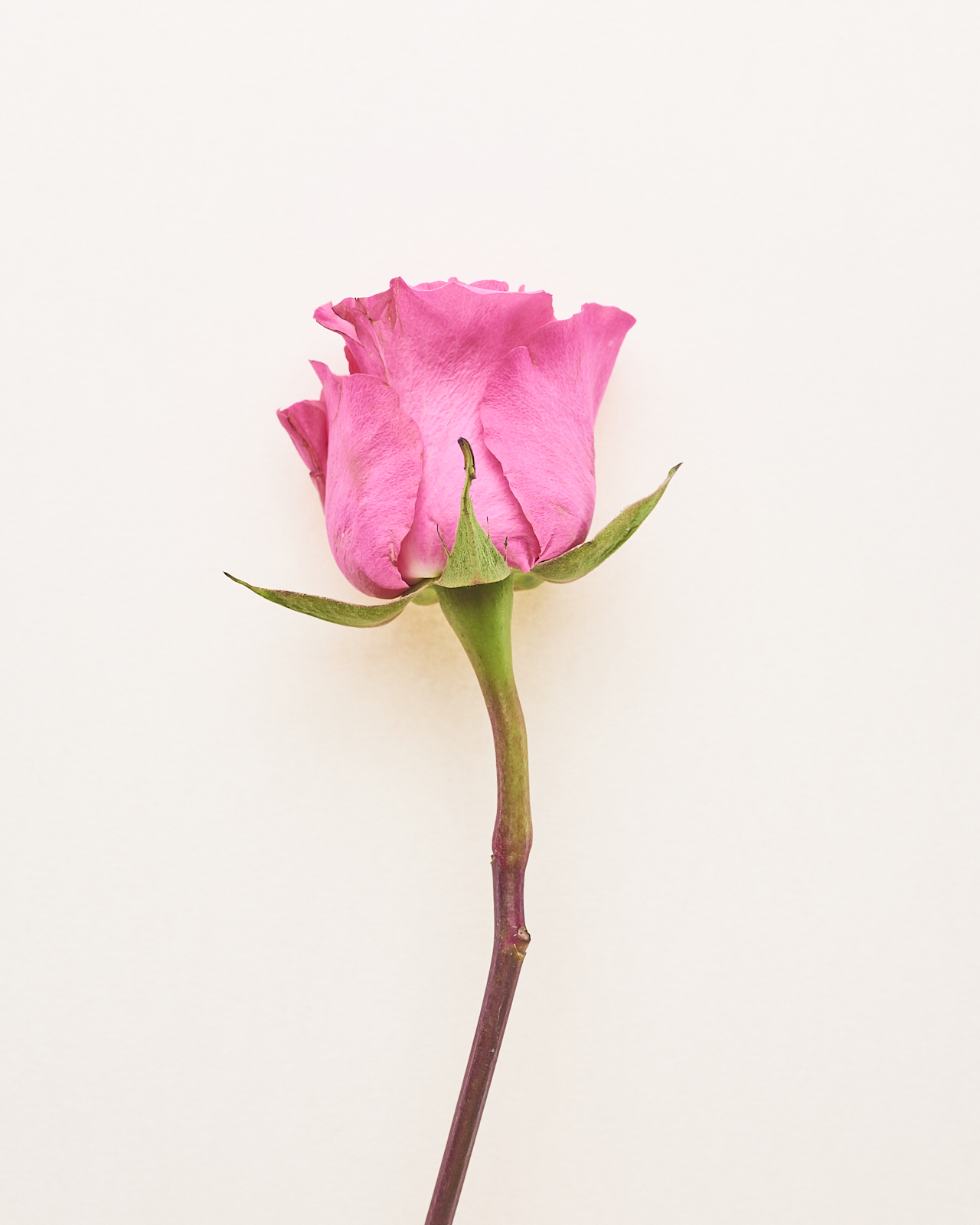
#220903.2: Study of Flowers 15.
And yet, if we look close enough, we can find variation and differences even in today’s roses, the shapes of the pedals, the colors of the stems, the peculiar way each flower decays. These two photos are form part of a pamphlet in a series of pamphlets on flowers, a sort of paper menagerie.
Zoom.Whiteboards. Smartboards. iPads. Tablets. Video. Flipped classrooms. Clickers. MOOCs. How much effort do we put into designing educational technologies? Who benefits from that effort? Rarely, it seems, the student (if the educational disaster of the last two years is any indication).
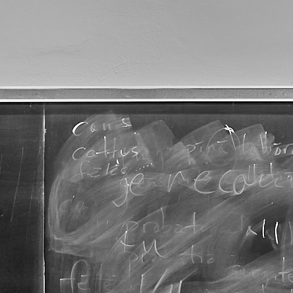
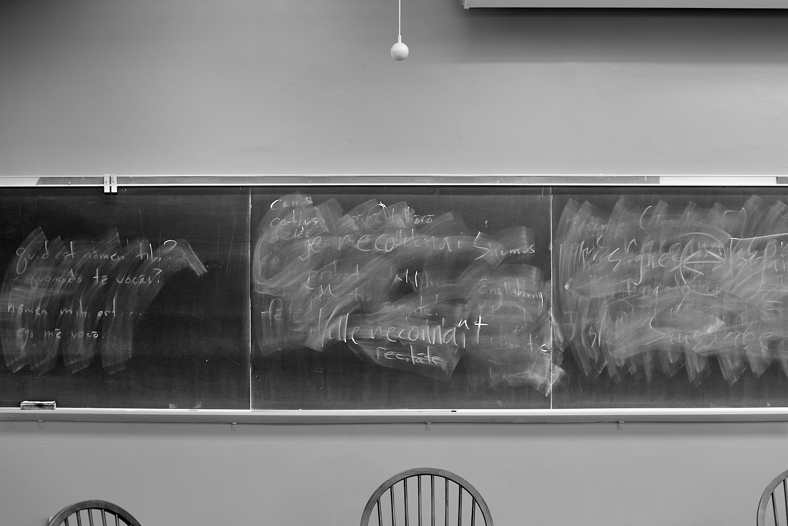
The blackboard was introduced into the classroom in the 19th century, and within a couple decades was ubiquitous. Since then pedagogues (and social critics) have praised and condemned the simple blackboard with its screechy chalk and dusty erasers. But there’s something dependable about its simplicity, and little evidence that the many innovations introduced since then have improved pedagogical effectiveness.
#220831: Blackboard as educational technology.
quid est nōmen tibi? quomōdo tē vocās? nōmen mihi est … ego mē vocō …
canis cattus fēlès je reconnais il/elle reconnaît recitāte
There is something almost poetic about the traces left on blackboards. Fleeting. Ephemeral. Momentary vestiges of teaching and resistance.
I did not know of Ray Johnson’s art before stumbling across information about the exhibit, “Please Send to Real Life” at The Morgan Library. I like the vernacular, collage aspects of his photography and art. It is not something to hang on a wall. It is not “beautiful” in any sense. But I really appreciate the immediacy of it, and its specificity. In the video introducing the exhibit, Joel Smith (the curator) describes Johnson’s work as:
Maybe the most salient characteristic of Ray Johnson’s art is its intimacy. He loved the idea of art as correspondence, as something that comes from one person and goes to one other person.
This description, “art as correspondence,” so neatly captures why I print and send postcards to random people, often unannounced, or leave small piles of them in cafes or on benches, each with some thought related in some way to the photo. Sometimes I open a map, point to a city, find some random address, and send a postcard to it. Other times I head out on foot with a stack of postcards, find a cafe, and write a bunch while enjoying a cup of coffee.
P.P. 52.12.0 — one of the early postcards in my postcards project.
Often these postcards are just scenes that caught my eye, becoming an opportunity to imagine an absurd history that could describe what I see. Some postcards are more typical, postcard images. Either way, they are opportunities to enact art as a correspondence, from me to a single other person.
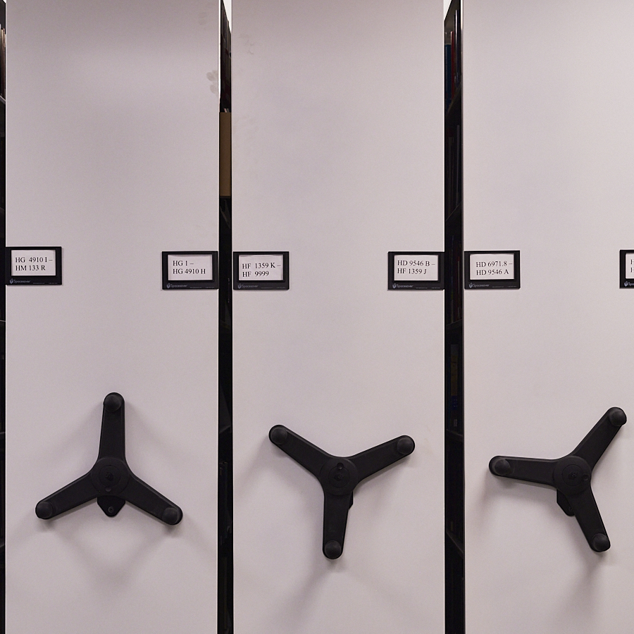
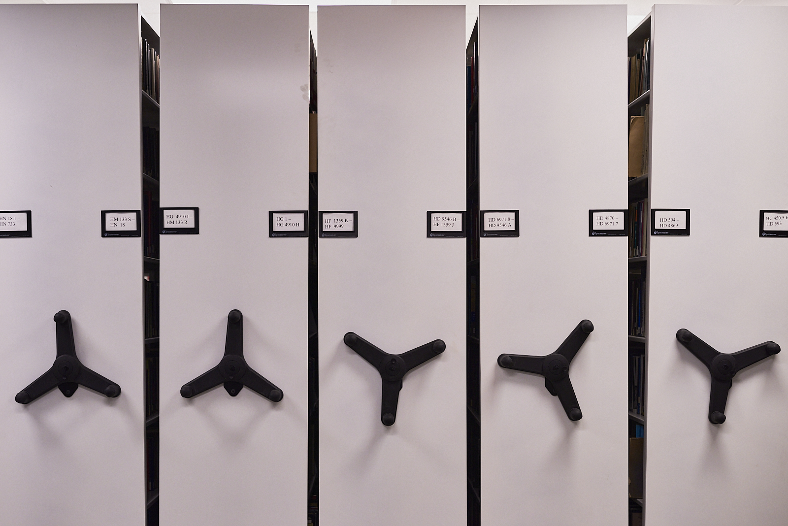
#220107: Compact shelving HC450.5 through HN733.
While I don’t think I’ll ever be a fan of Ray Johnson’s art, per se, I am a fan of his understanding of what art can be.