Tag: Lutnick Library

  • A Sense of Space

    A Sense of Space

    In A Sense of Place, A Sense of Time John Brinckerhoff Jackson reflects on the meaning of our increasingly urbanized and industrialized landscapes and how we interact with and live in those spaces. He is neither the first nor the most recent to draw attention to various aspects of the built environment, with a particular focus on vernacular structures, e.g., garages, mobile homes, parking lots. His book does seem to me to be more optimistic than many.

    Interior #220226.1. A color photograph of lockers with locks hanging from the doors.
    Interior #220226.1

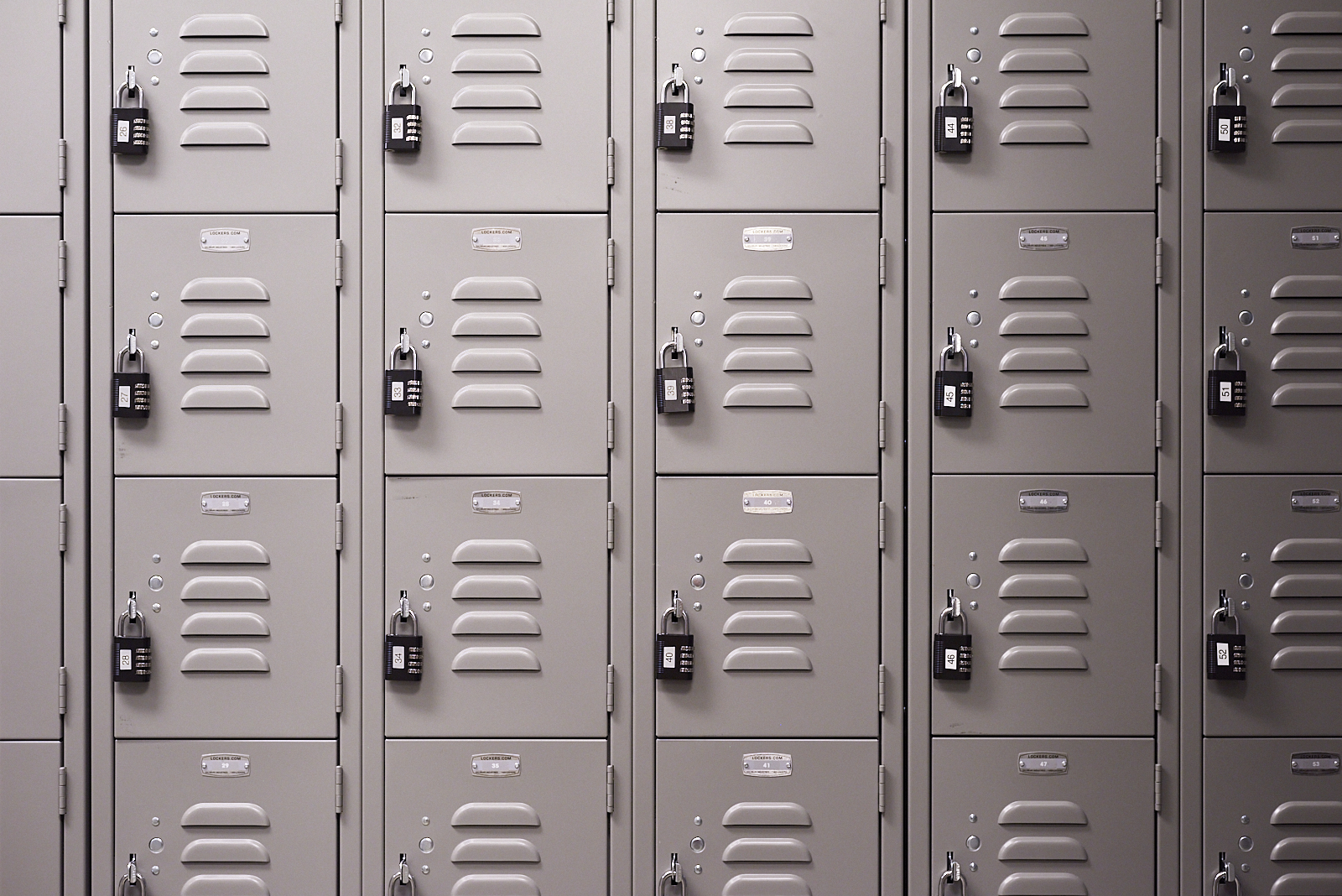
    Reading Jackson’s book made me think about the changing vernacular of interior spaces that permeates a significant portion of a new library. What sort of behavior and activities do these spaces encourage? What comparisons to the color schemes and lighting invite? How are different parts of the library marked by different interior spaces? How does it all differ from the former, dank and crowded and dark library?

    Interior #220830. A color photograph of the ends of compact shelving, with a stool on the floor in front of them.
    Interior #220830

    The different floors of the library are intended for different practices, embodied in the layout and decor and furniture on each.

    Interior #220226.0. A color photograph of two chairs on wheels in the corner of a room.
    Interior #220226.0

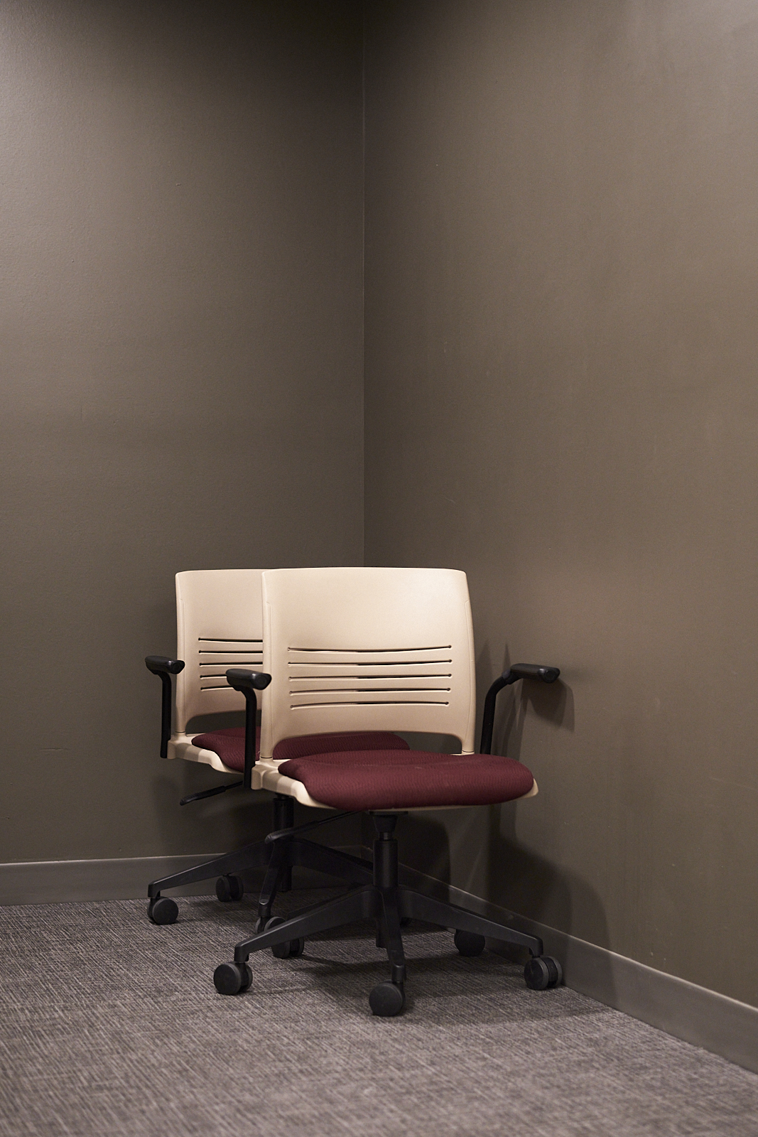
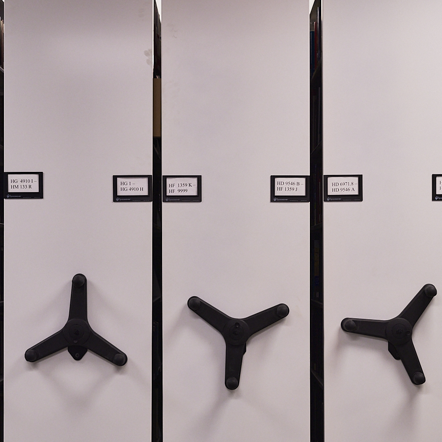
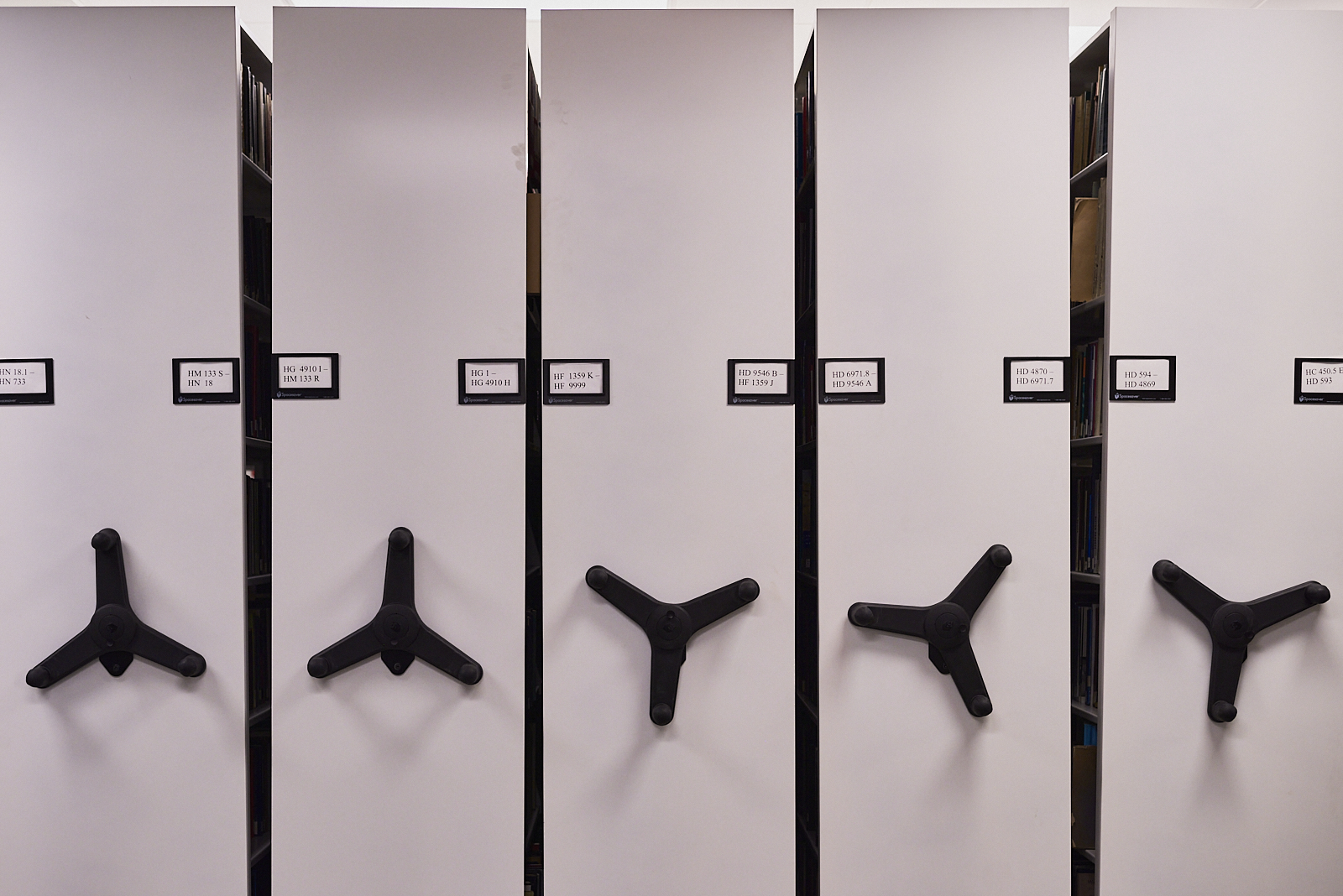
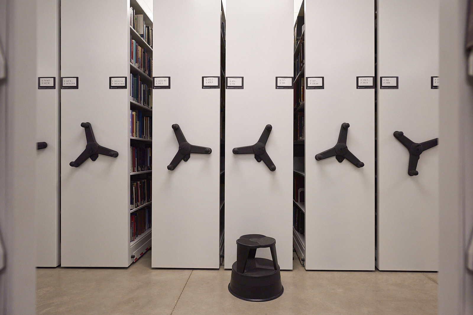
    Nobody would relax in these chairs, with their wheels, rigid backs, and spare armrests they are clearly intended to be tools. Roll up to your desk, work, pivot if necessary, roll back. Built for labor not for comfort. Unsurprising to find these near the stacks of books packed tight in their compact shelving.

    Interior #230106. A color photograph of an armchair and a table illuminated by a floor lamp and a recessed light.
    Interior #230106

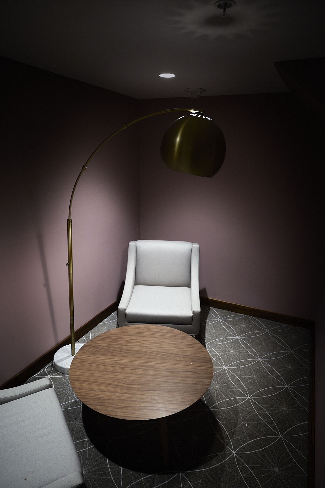
    Ascend from the bowels of the building to find comfort, warmer color palettes, and tables that invite leisure rather than work. Nestled in alcoves are comfortable chairs around a table where you can linger, perhaps read a book or chat with a friend. Whatever work occurs here, it is of a decidedly sort from that which happens in the floor below.

    There’s a particular, almost poetic beauty to these different spaces. The limited palettes, the orthogonal repetition of the lower floor echo visually the rigid, tabular presentation of information. Down there habits and practices are structured and regularized. One floor up, the welcoming curves of the chairs, the table, the lamp, and soft cushions almost demand a different set of activities. Here conversations and work, insofar as that occurs on this floor, are less regulated. Just as Robert Adams found beauty in truck stops, generic houses, unadorned churches, and roads, we can find beauty in quotidian spaces, with their subtle efforts to shape our behaviors. We just need to pause and linger a bit, to look around.

  • “Art as Correspondence”

    “Art as Correspondence”

    I did not know of Ray Johnson’s art before stumbling across information about the exhibit, “Please Send to Real Life” at The Morgan Library. I like the vernacular, collage aspects of his photography and art. It is not something to hang on a wall. It is not “beautiful” in any sense. But I really appreciate the immediacy of it, and its specificity. In the video introducing the exhibit, Joel Smith (the curator) describes Johnson’s work as:

    Maybe the most salient characteristic of Ray Johnson’s art is its intimacy. He loved the idea of art as correspondence, as something that comes from one person and goes to one other person.

    This description, “art as correspondence,” so neatly captures why I print and send postcards to random people, often unannounced, or leave small piles of them in cafes or on benches, each with some thought related in some way to the photo. Sometimes I open a map, point to a city, find some random address, and send a postcard to it. Other times I head out on foot with a stack of postcards, find a cafe, and write a bunch while enjoying a cup of coffee.

    A color photograph of a playground duck that has been spray painted.
    P.P. 52.12.0 — one of the early postcards in my postcards project.

    Often these postcards are just scenes that caught my eye, becoming an opportunity to imagine an absurd history that could describe what I see. Some postcards are more typical, postcard images. Either way, they are opportunities to enact art as a correspondence, from me to a single other person.

    Urban #220107: Color photograph of compact shelving in a library.
    #220107: Compact shelving HC450.5 through HN733.

    While I don’t think I’ll ever be a fan of Ray Johnson’s art, per se, I am a fan of his understanding of what art can be.